Sentry Page Protection
Market/Model Commentary
Currently the active model portfolio as defined by our 5-factor model is:
ECAM 5-Factor Composite Model

|
YELLOW |
|
ECONOMIC FACTOR SUB-MODEL
|

|
|
|
TECHNICAL FACTOR SUB-MODEL
|
|
|
|
VALUATION FACTOR SUB-MODEL
|

|
|
|
SENTIMENT FACTOR SUB-MODEL
|
|
|
|
LIQUIDITY (Stress) FACTOR SUB-MODEL
|
|
|
"Slow and Steady wins the race"
The Hare and the Tortoise
Aesop (Greek slave & fable author 620 BC - 560 BC)
"Technical Analysis is a windsock, not a crystal ball"
Carl Swenlin (Technical Analyst)
"Investing is the intersection of economics and psychology"
Seth Klarman (Hedge fund Manager, Baupost Group)
"Everyone's got a plan ..... until they get punched in the face"
Mike Tyson (Former World Heavyweight Boxing Champion)

Latest Updates
DOW JONES GLOBAL INDEX
(17 May 2024)
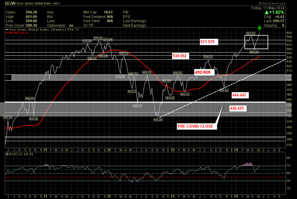
Global equities were higher this past week with a percentage return (as measured by the Dow Jones Global Index) of +1.60%. This week price closed above the 40 week moving average and above price support @ 571-579.
Technical Analysis Summary (Dow Jones Global Index)
Click to set custom HTML
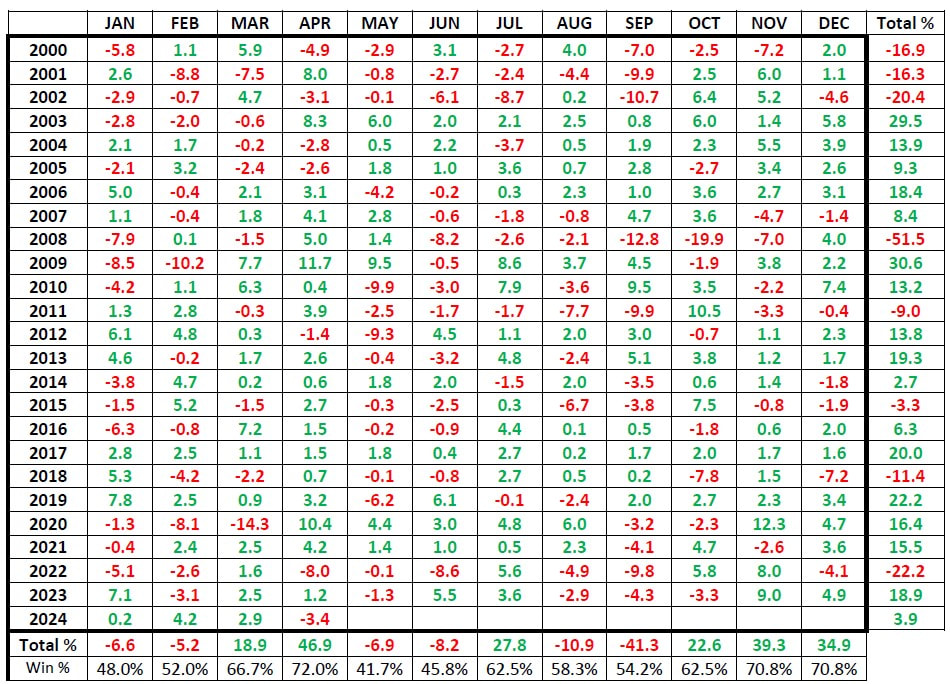
Dow Jones Global Index Historical Monthly Returns
The month of April closed with a loss of -3.4%. We are now within May which has historically been a modestly weak month within the seasonal cycle:
- -6.9% cumulative percentage return over the past 24 years.
- 41.7% win percentage.
- greatest gain +9.5% (2009)
- greatest loss -9.9% (2010)
Weekly Global Macro Review
U.S. Equities
The Dow Jones Industrial Average, S&P 500 Index, and Nasdaq Composite climbed to record highs during the week. As inflation and interest rate worries appeared to dissipate, growth stocks outperformed.
The Dow Jones Industrial Average, S&P 500 Index, and Nasdaq Composite climbed to record highs during the week. As inflation and interest rate worries appeared to dissipate, growth stocks outperformed.
|
S&P 500:
DJIA: NASDAQ 100: S&P 400 Mid-cap: Russell 2000 Small Cap: |
+1.5%
+1.2% +2.1% +0.7% +1.7% |
The major factor supporting sentiment appeared to be Wednesday’s release of the Labor Department’s April consumer price index (CPI), which came in at or modestly below expectations, in contrast to hotter-than-expected prints over the preceding three months. Headline prices rose 0.3% in April (below expectations) while core (less food and energy) prices rose 0.3% (as expected). Inflation remained concentrated in services prices, especially transportation services costs, which rose 0.9% over the month and 11.2% over the past year.
Thursday’s retail sales figure also appeared to impress investors—if through the lens of bad news for the economy being treated as good news for stocks and inflation. The Commerce Department reported that retail sales were flat in April versus consensus estimates of a 0.4% gain, while downwardly revising its estimate of March sales lower, from +0.7% to +0.6%. The data included some evidence that consumers were pulling back on discretionary spending, with sales at non-store (mostly online) retailers falling 1.2%, while sales at restaurants and bars continued to moderate—and even fell slightly when taking account of higher prices (retail sales data are not adjusted for inflation).
US Bonds
The downside inflation and growth surprises helped drive the yield on the benchmark 10-year U.S. Treasury note to its lowest level in over a month at midweek. (Bond prices and yields move in opposite directions.)
Spreads initially widened in the investment-grade bond market before tightening in the latter half of the week. Issuance was front-end heavy with few issues oversubscribed. High yield bonds also benefited from the rate moves, and trade volumes picked up following the encouraging inflation data. Below investment-grade funds reported positive flows.
Europe/UK Equities
In local currency terms, the pan-European STOXX Europe 600 Index rose +0.4% but slipped from the record high hit during the week. Cautious comments from European Central Bank (ECB) members appeared to cool optimism about the extent to which monetary policy might ease this year. Major stock indexes were mixed.
|
German DAX:
French CAC: Italian MIB: Spanish IBEX: U.K. FTSE 100: |
-0.4%
-0.6% +2.1% +2.0% -0.2% |
The annual rate of pay growth in the UK, excluding bonuses, was unchanged at 6% in the three months through March, which was slightly higher than forecast. In the private sector, regular pay growth came in at 5.9%, slightly less than expected by the Bank of England, which monitors the measure. The labor market, however, appeared to slacken. The main unemployment rate rose to 4.3%, while job openings declined for a 22nd consecutive month.
Overall, the data tentatively support a reduction in interest rates in June, as a transition to a looser labor market appears now to be underway. However, policymakers will need to digest a few more data releases before deciding whether to ease rates.
ECB policymakers Francois Villeroy de Galhau, Madis Muller, and Martins Kazaks indicated that a rate cut is likely in June but that the path thereafter is uncertain. Executive Board member Isabel Schnabel told the Nikkei newspaper that the current data did not justify another reduction in July, in part because the disinflation process appears to have slowed significantly. Belgian central bank Governor Pierre Wunsch told the Handelsblatt newspaper “the first half a percentage point of interest rate cuts is close to a no brainer” but slower policy easing by the Federal Reserve could delay further moves. He stressed that he was not backing a second rate cut in July.
Eurozone industrial production rose for a second month running in March, increasing 0.6% sequentially. However, the stronger-than-expected reading was driven by a jump in Ireland’s output, a data point that historically has been quite volatile.
Japan
Japanese equities finished the week higher, with the Nikkei 225 Index gaining +1.5% and the broader TOPIX Index up +0.6%. This was despite a backdrop of economic weakness and a range-bound yen on expectations of U.S. interest rate cuts in contrast to tentative hawkishness on the part of the Bank of Japan (BoJ), the latter also sending Japanese government bond (JGB) yields modestly higher.
Investors appeared to shrug off weakness in Japan’s economy, as signaled by a weaker-than-expected first-quarter gross domestic product print—a 2.0% annualized contraction on the previous three-month period—which was driven in part by the negative impact on growth of the earthquake that hit the Noto peninsula in January, as well as the suspension of some auto production activity. Other areas of weakness included capital expenditure and external demand, while, conversely, strength in public demand and private inventories lent support.
The yen finished the week broadly unchanged in the high-JPY 155 range against the USD. This was within the context of expectations that the U.S. Federal Reserve could cut interest rates twice this year, while the BoJ is widely anticipated to embark on further monetary policy normalization—thereby leading to a reduced interest rate differential between the two economies. Such an eventuality could lend support to the yen, which continues to languish at historic lows despite investors converging around the view that Japanese authorities recently intervened twice in the foreign exchange markets to prop up the currency.
The yield on the 10-year JGB rose to 0.94%, from 0.91% at the end of the previous week. Upward pressure on yields was at least temporarily exerted by hawkish signals from the BoJ, as it reduced the amount of JGBs it offered to buy in a regular purchase operation. However, a reduction in purchases had been widely anticipated, which meant that the rise in yields was only modest.
China
Chinese equities were little changed after the central government unveiled on Friday a historic rescue package to stabilize the country’s ailing property sector. The Shanghai Composite Index was broadly flat, while the blue chip CSI 300 added +0.3%. In Hong Kong, the benchmark Hang Seng Index gained +3.1%.
The People’s Bank of China (PBOC) lowered the minimum down payment ratio by 5% to 15% for first-time buyers and to 25% for second home purchases in an attempt to ignite demand. The PBOC also said that it would scrap the nationwide floor level of mortgage rates and allow cities to make their own decisions on what mortgage rates to charge. Under a so-called re-lending program, the central bank said it would extend RMB 300 billion in low-cost funds to a select group of state-owned banks to lend to local state-owned entities for the purchase of unsold homes.
The unprecedented support package came as data showed no sign of turnaround in China’s years-long housing crisis. New home prices in China fell by 0.6% month on month in April, according to the statistics bureau, marking the 10th straight monthly decline and the steepest drop since November 2014. Real estate investment fell a higher-than-expected 9.8% in the January-to-April period from a year earlier, following a 9.5% drop in the first quarter.
Inflation data showed that deflationary pressure continued to weigh on China’s economy. China’s consumer price index rose 0.3% in April from a year ago, accelerating from March’s 0.1% increase and marking the third consecutive positive reading. However, the producer price index fell 2.5% from a year ago compared with a 2.8% drop in March.
Other data also showed an uneven recovery for China’s economy. Industrial production rose an above-forecast 6.7% in April from a year earlier, accelerating from March’s 4.5% increase. However, fixed-asset investment and retail sales both increased less than expected, underscoring anemic domestic demand. The urban unemployment rate fell to 5.0% from 5.2% in March.
Weekly Performance
U.S. Indices
Dow +1.2% to 40,004. S&P 500 +1.5% to 5,303. Nasdaq +2.1% to 16,686. Russell 2000 +1.9% to 2,095. CBOE Volatility Index -4.5% to 11.99.
S&P 500 Sectors
Consumer Staples +0.7%. Utilities +1.2%. Financials +1.4%. Telecom +1.7%. Healthcare +1.8%. Industrials -0.4%. Information Technology +2.9%. Materials +0.3%. Energy +0.7%. Consumer Discretionary -0.1%. Real Estate +2.5%.
World Indices
London -0.2% to 8,420. France -0.6% to 8,168. Germany -0.4% to 18,707. Japan +1.4% to 38,767. China -0.1% to 3,154. Hong Kong +3% to 19,554. India +1.8% to 73,960.
Commodities and Bonds
Crude Oil WTI +2.2% to $80./bbl. Gold +1.9% to $2,419.8/oz. Natural Gas +17.1% to 2.638. Ten-Year Bond Yield -0.2 bps to 4.422.
Forex and Cryptos
EUR/USD +0.93%. USD/JPY -0.04%. GBP/USD +1.44%. Bitcoin +9.9%. Litecoin +3.1%. Ethereum +6.5%. XRP +3.5%.
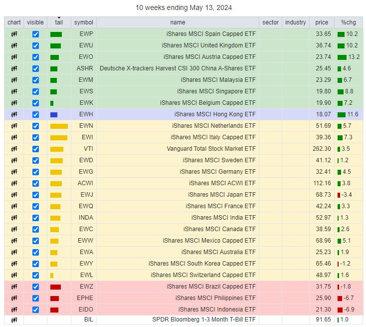
WEEKLY ASSET CLASS MONITOR
(week ending 17 May 2024)
(week ending 17 May 2024)
|
Asset Class
|
Region
|
ETF Ticker
|
Weekly
Return |
2024 Return
|
|
Equities
|
World
U.S. Europe Asia Pacific ex-Japan Emerging Market |
VT
VTI VGK AAXJ VWO |
+1.72%
+1.65% +1.67% +3.47% +3.29% |
+9.73%
+10.96% +9.29% +10.33% +9.32% |
|
Bonds
|
U.S. Bonds
International Bonds Global Bonds |
BND
BNDX BNDW |
+0.60%
+0.14% +0.40% |
-1.22%
-0.57% -0.91% |
|
Real Estate Equities
|
Global Real Estate Equities
|
REET
|
+2.39%
|
-2.09%
|
|
Precious Metals Equities
|
Global Gold Miners
Global Junior Gold Miners |
RING
GDXJ |
+4.28%
+6.70% |
+20.02%
+22.26% |
GLOBAL EQUITY MARKET MONITOR
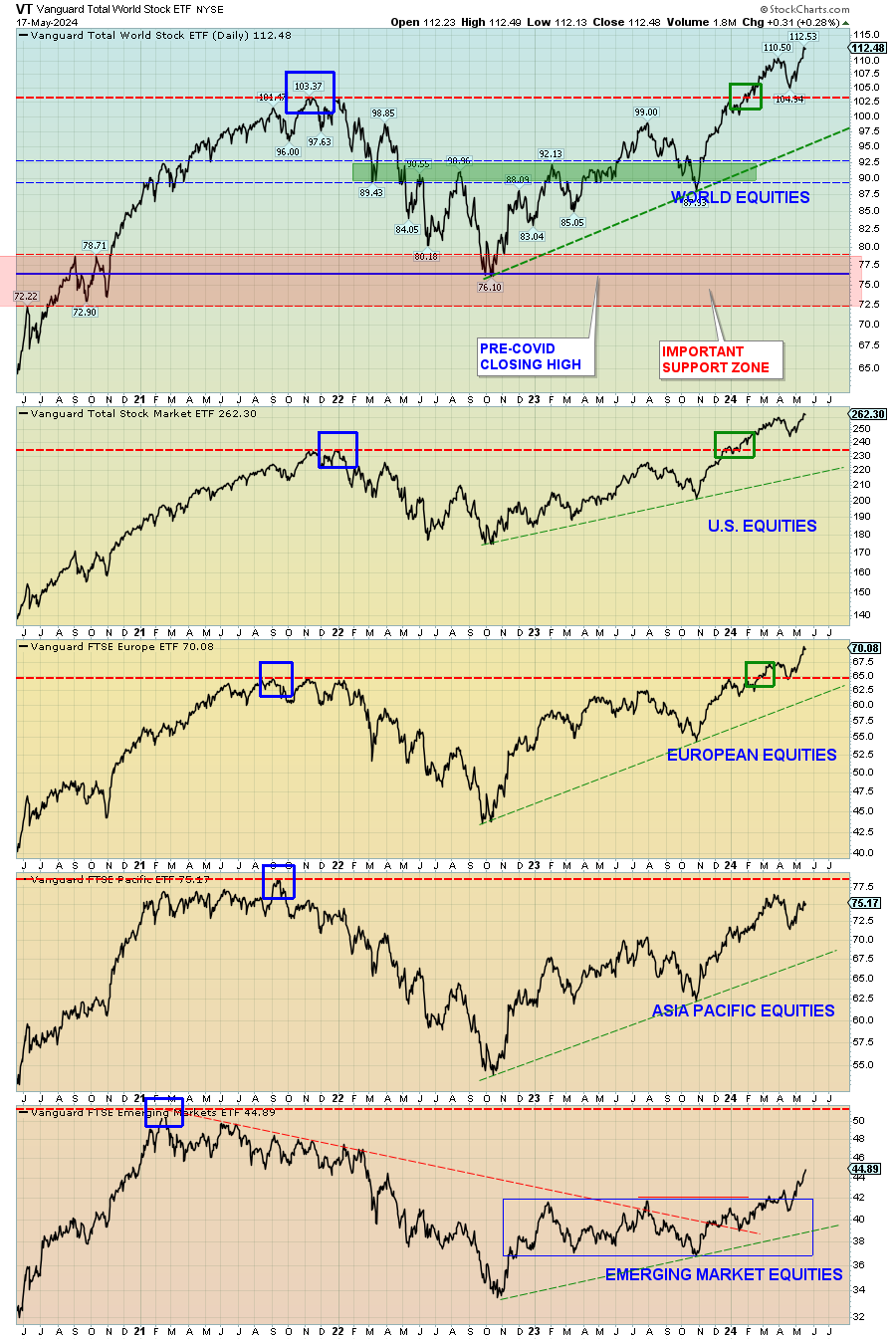
The past 4 years have been very challenging for global equities. They had a wicked roller-coaster ride in 2020 on the back of the Covid pandemic where they peaked on 12 Feb 2020 and fell dramatically (-34%) into their 23 Mar lows. They then rebounded and regained their losses by year-end.
For most of 2021 they remained largely in a "holding pattern" digesting their gains but declined considerably throughout 2022 before bottoming in October. Strong returns have been seen since the Oct/22 bottom with global equities recently exceeding past all-time highs (previous highs for all regions shown as blue box)
For most of 2021 they remained largely in a "holding pattern" digesting their gains but declined considerably throughout 2022 before bottoming in October. Strong returns have been seen since the Oct/22 bottom with global equities recently exceeding past all-time highs (previous highs for all regions shown as blue box)
Asset Class Return Monitor
(for week ending 17 May 2024)
(for week ending 17 May 2024)
Equities Legend:
Bonds Legend:
Currencies Legend:
Commodities Legend:
- Vanguard Total World Stock ETF (VT): (Cyan)
- Vanguard Total U.S. Stock Market ETF (VTI): (Red)
- Vanguard FTSE Europe ETF (VGK): (Lime Green)
- Ishares MSCI Asia ex-Japan ETF (AAXJ): (Dark Blue)
- Vanguard FTSE Emerging Markets ETF (VWO): (Pink)
Bonds Legend:
- Vanguard Total U.S. Bond Market ETF (BND): (Black)
- Vanguard Total International ex-U.S. Bond ETF (BNDX): (Green)
Currencies Legend:
- U.S. Dollar Index (Cash Settlement EOD) ($USD): (Orange)
- Euro (Philadelphia Index) ($XEU): (Maroon)
Commodities Legend:
- PowerShares DB Commodity Index Tracking Fund (DBC): (Purple)
- SPDR Gold ETF (GLD): (Sky Blue)
Past Week Asset Class returns

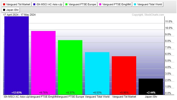
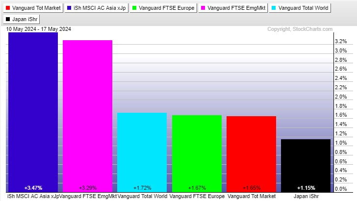
- Over the past week global equities (as measured by the Vanguard Total World Stock ETF (shown in CYAN) gained +1.72%.
- Asia Pacific-ex Japan markets were the top performing equity region this past week with US markets lagging.
- U.S. bonds (Black) and International bonds (Green) were higher on the week.
- Commodities were higher on the week with the U.S. Dollar index down -0.80%.
Year-to-Date (2024) Asset Class returns
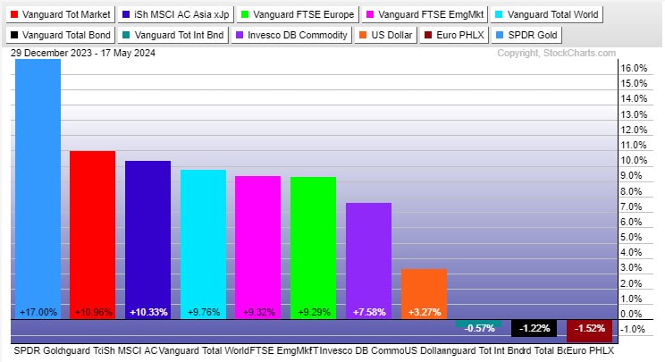
- In 2024 global equities (as measured by the Vanguard Total World Stock ETF shown in CYAN) have gained +9.76%.
- US market equities are the top performing equity region year-to-date with European markets lagging.
- Bonds have had negative returns in 2024 with U.S. bonds (Black) under-performing International Bonds (Green).
- The US Dollar index has gained +3.27% year-to-date.
The stock market is driven by a combination of corporate profits, trends, economic data, fund flows, expectations, greed, fear, opinions, analysis, geopolitical events and human nature. These variables are often in conflict with one another (especially in the short run) and form a sine-wave cycle of investor psychology which begins with optimism, peaks with euphoria, bottoms with despair and returns to optimism.
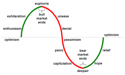
It must be reemphasized a complete market cycles is composed of 2 distinct cycles/phases: a "bull 1/2 cycle" and a "bear 1/2 cycle".
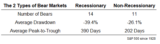
The Math of Losses
- a 20% loss requires a 25% gain to return to breakeven
- a 30% loss requires a 43% gain to return to breakeven
- a 40% loss requires a 67% gain to return to breakeven
- a 50% loss requires a 100% gain to return to breakeven
- a 60% loss requires a 150% gain to return to breakeven
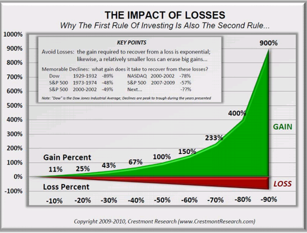
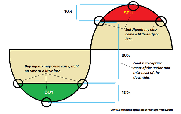
This is why it is so important to not let losses continue in the face of a bear market decline and why we advocate phased movements into cash as our 5-factor model reverts to Red. The below graphic represents how we move within equity markets through a complete sine-wave market cycle:
World Regional Equity Monitor
We use the following U.S. exchange traded funds to monitor equity performance for the various world regions:
- World Equities: Vanguard Total World ETF (Cyan)
- U.S. Equity: Vanguard Total Market ETF (Red)
- European Equity: Vanguard FTSE Europe ETF: (Lime Green)
- Japan Equity: iShares Japan ETF (Black)
- Asia ex-Japan Equity: iShares MSCI All-Country Asia ex-Japan ETF (Blue)
- Emerging Market Equity: Vanguard FTSE Emerging Market ETF (Pink)
1 Year Rolling Regional Equity Performance


- Over the past 12 month rolling period regional equity performance has been positive for monitored regions.
- The strongest equity regions over the past 12 month have been US markets with Japanese/European/Asia Pacific ex-Japan/Emerging market equities lagging.
- Overall world equity performance (as measured by the Vanguard Total World ETF) have returned +23.40% (including dividends) over the past 12 month rolling period.
3 Month Rolling Regional Equity Performance

- Over the past 3 month rolling period the strongest performing world equity region has been Asia Pacific ex-Japan markets with Japanese markets the weakest.
- Positive equity returns have been evident over the past quarter (3 months) in monitored regions.
1 Month Rolling Regional Equity Performance
- Over the past 1 month rolling period the strongest performing world equity region has been Asia Pacific ex-Japan markets with Japanese markets the weakest.
- Positive equity returns have been achieved over the past month for monitored regions.
Past Week Regional Equity Performance
- Over the past week the major global equities were higher with Asia Pacific ex-Japan markets outperforming other regions.
Latest Global Equity "Big Picture"
World equity market returns are monitored via the following index and ETF equity charts:
- Dow Jones Global Market Index (cap-weighted)
- Value Line Geometric U.S. Index (equal-weighted)
- Global Dow Index (equal-weighted)
- MSCI ACWI ETF (cap-weighted)
Dow Jones Global Market Index
(market cap weighted index)

For the week the Dow Jones Global Index had a gain of +1.60%. Price closed above the 52 week moving average (green line) and at resistance @ 575-579.
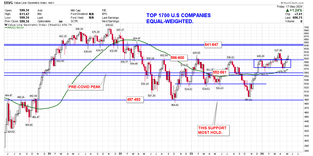
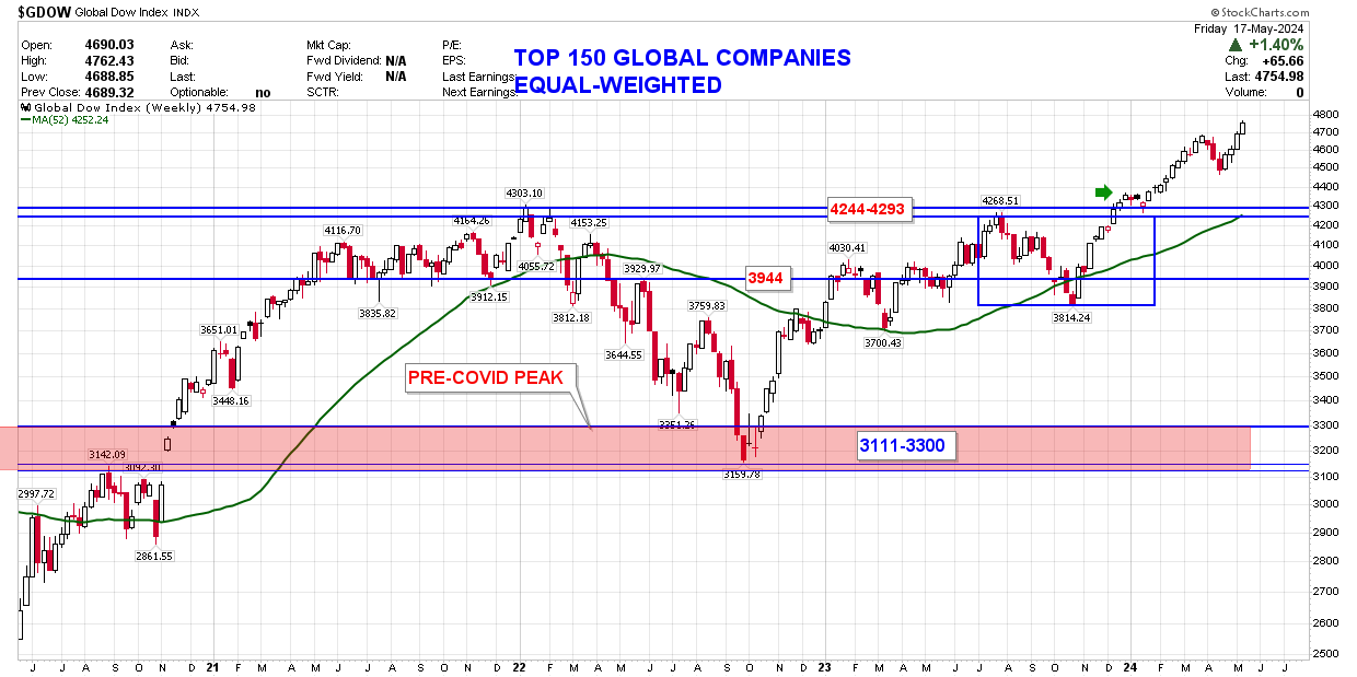
Value Line Geometric Index and Global Dow Index
(equal weighted indexes)
The Value Line Geometric Index ($XVG) is the median price performance of 1700 U.S. companies equal weighted (as opposed to most indexes which are market cap weighted) into an index. The Global Dow index ($GDOW) is a measure of the top 150 international companies equal weighted within the index.
These indexes are important as they equal-weight the price performance of all the companies held within the respective index. This removes the distortions associated with a small group of highly valued companies (which may be performing well) masking the performance of struggling companies and represents a good overview of overall internal equity breadth/strength.
These indexes are important as they equal-weight the price performance of all the companies held within the respective index. This removes the distortions associated with a small group of highly valued companies (which may be performing well) masking the performance of struggling companies and represents a good overview of overall internal equity breadth/strength.
Value Line Geometric Index ($XVG) Weekly
Global Dow Index ($GDOW) Weekly
iShares MSCI ACWI ETF
(market cap weighted ETF)
The iShares MSCI ACWI (All Country World Index) ETF is used as a benchmark to compare the performance of the various broad-based equity funds available in the Emirates Group Provident Scheme (EGPS) A/B/C accounts. It serves as a benchmark to determine how equity markets are performing on a worldwide basis. This assists in determining 2 parameters; whether to be invested in equities and also which funds within the EGPS offer the best performance relative to the benchmark.
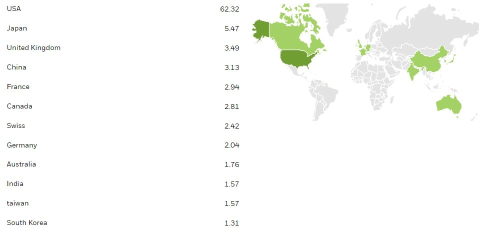
The ETF is composed of the following regional components/weightings:
The ETF is composed of the following regional components/weightings:
ACWI Monthly Chart

Global equity markets bottomed in Oct 2022 and have reached new all-time highs.
For the month of May ACWI has gained +3.73%. It closed the month of April above the 12 month simple moving average (blue moving average on the chart above) keeping the long term trend BULLISH until month end.
For the month of May ACWI has gained +3.73%. It closed the month of April above the 12 month simple moving average (blue moving average on the chart above) keeping the long term trend BULLISH until month end.
ACWI Weekly Chart

This past week ACWI gained +1.61%. Price closed above the 40 week simple moving average (shown in GREEN) and this week closed above support @ 101.98-102.16.
World Equity Market Regional Relative Rotation Graphs
Below is a graph of 24 major regional equity market ETF's + ACWI (our world equity benchmark) shown on a Relative Rotation chart measured weekly with a 10 week look-back period (which forms the "tail" of the ETF). This graph allows us to observe over time how various regional ETF's are moving relative to both each other and also relative to cash.
- Leading (Green): (Momentum Positive + Price Relative Strength Positive)
- Weakening (Yellow): (Momentum Negative + Price Relative Strength Positive)
- Lagging (Red): (Momentum Negative + Price Relative Strength Negative)
- Improving (Blue): (Momentum Positive + Price Relative Strength Negative)
Given the cyclical nature of momentum and price within equity markets, in general the RRG charts will cycle in a clockwise manner (though not necessarily will each pass through all 4 quadrants as it is possible to rotate through an adjacent quadrant only).
Weekly Regional (Country) Relative Rotation Graphs (long term)

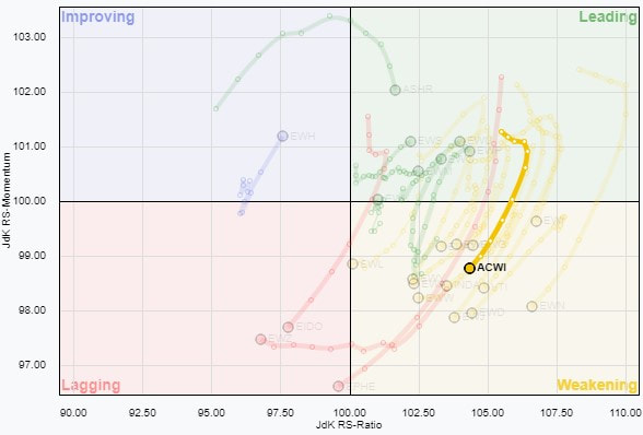
The RRG trend analysis status is currently NEUTRAL for world equities:
- ACWI Weekly Quadrant: "WEAKENING" Quadrant
- 24 Country Net Score: NEGATIVE
- ACWI price Relative Strength (horizontal axis): POSITIVE
- ACWI price Momentum (vertical axis): NEGATIVE
Coincident Equity Market Indicators
Crude Oil
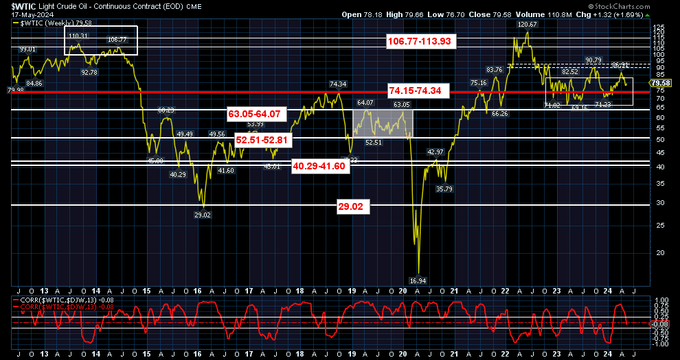
Crude oil was higher over the past week and has returned to its previous range. The 3-month correlation between crude oil and global equities is neutral.
Gold
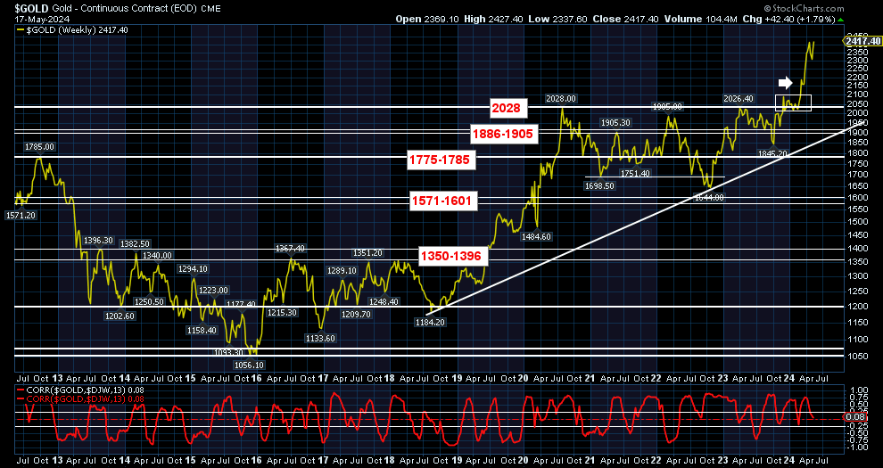
Gold was higher over the past week and closed above support @ 2028. The 3-month correlation between gold and global equities is neutral.
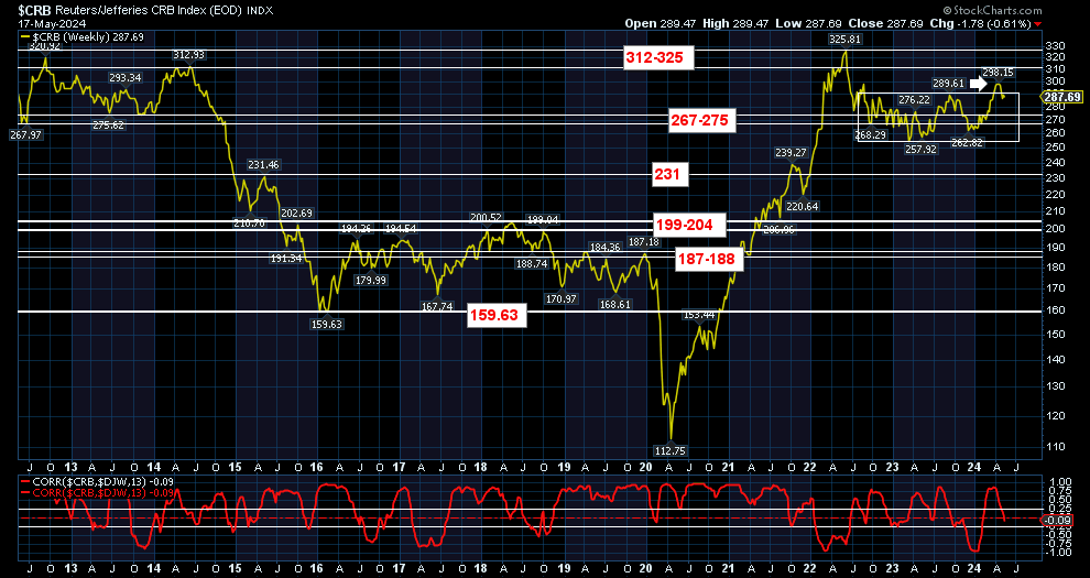
Commodities
Commodities were lower over the past week and closed within their previous range. The 3-month correlation between commodities and global equities is neutral.
U.S. 30 Year Treasury Bond

U.S. 30 year bond prices were higher over the past week. The 3-month correlation between US government bonds and global equities is positive.
Current 5-Factor Model Indications
The combined 5-Factor quantitative model is currently YELLOW (neutral). This indicates an even level of risk at present. The 5-Factor model currently has the following sub-model readings:
Economic Model
The Economic model is currently GREEN. The 1-year rate-of-change in global economic data had moved towards contraction but has stabilized over the past several months. The model is composed of numerous inputs including data from the following sources:
Forward Forecast Data:
Forward Forecast Data:
- OECD Composite Leading Indicators (CLI)
- J.P. Morgan Global Purchasing Managers (PMI) Index
- World Bank Monthly Global Economic Report
OECD Composite Leading Indicators
(data as of 13 May 2024)
The OECD Composite Leading Indicator (CLI) is designed to predict business cycle changes 6-9 months in advance. It provides early signals of turning points in business cycles showing fluctuation of the economic activity around its long term potential level.
Click to set custom HTML
Below is our latest heat-map of the Composite Leading Indicators for various monitored regions.
Ideally we want to see the majority of regions indicating a CLI > 100 as well as steady/improving trends month-over-month and year-over-year.
- Red/Green numbers indicates above/below average future projected economic growth.
- Red/Green boxes indicates CLI change month/month and year/year.
Ideally we want to see the majority of regions indicating a CLI > 100 as well as steady/improving trends month-over-month and year-over-year.
Click to set custom HTML
J.P. Morgan Purchasing Managers Index (PMI)
(06 May 2024)
(06 May 2024)
The J.P. Morgan monthly PMI Report is based on the results of manufacturing and service sector surveys covering over 18,000 purchasing executives in over 40 countries. Together these countries account for an estimated 89% of global gross domestic product (GDP).
Questions are asked about real events and are not opinion based. Data are presented in the form of diffusion indices, where an index reading above 50.0 indicates an increase in the variable since the previous month and below 50.0 a decrease. As such, using the PMI data gives us a real-time look at global growth.
Questions are asked about real events and are not opinion based. Data are presented in the form of diffusion indices, where an index reading above 50.0 indicates an increase in the variable since the previous month and below 50.0 a decrease. As such, using the PMI data gives us a real-time look at global growth.
- readings > 50 indicate economic expansion
- readings < 50 indicate economic contraction.
Latest Key Findings:
- Global Composite Output Index rose to 52.4 (52.3 the previous month) and remains in expansion. It remains below the long term average Global PMI measure of 53.2.
- Global Manufacturing fell to 50.3 (50.6 the previous month) and remains in modest expansion.
- Global Services rose to 52.7 (52.5 the previous month) and remains in steady expansion.
Global PMI Commentary
Below is our PMI monitor for selected regions/countries.
- numerical values > 50 (GREEN) indicate economic expansion in progress.
- numerical values < 50 (RED) indicating economic contraction in progress.
- trend box GREEN indicates improvement over the past month with RED indicating a decline over the previous month.
The latest data points to a strengthening of global growth from the late 2023 lows. The Global Composite Index remains in expansion (reading above 50)
World Bank Global Monthly Outlook
(April 2024)
(April 2024)
U.S. Economic Growth & Inflation
Year-over-Year GDP growth
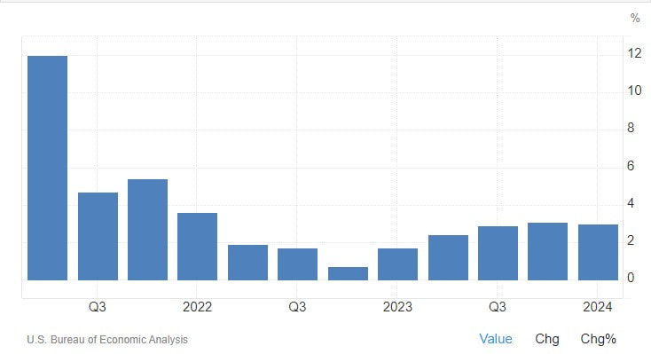
The US economy expanded 3% year-on-year in the first quarter of 2024, slightly below 3.1% in the last three months of 2023. GDP Annual Growth Rate in the United States averaged 3.15 percent from 1948 until 2024, reaching an all time high of 13.40 percent in the fourth quarter of 1950 and a record low of -7.50 percent in the second quarter of 2020.
Quarter-over-Quarter GDP growth
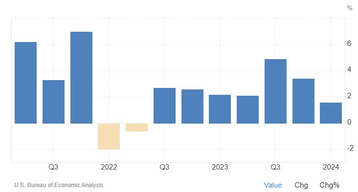
The US economy expanded an annualized 1.6% in Q1 2024, compared to 3.4% in the previous quarter and below forecasts of 2.5%. It was the lowest growth since the contractions in the first half of 2022, the advance estimate showed. A slowdown was seen for consumer spending (2.5% vs 3.3%), mainly due to a fall in goods consumption (-0.4% vs 3%) while spending on services rose faster (4% vs 3.4%). Non-residential investment also eased (2.9% vs 3.7%), due to structures (-0.1% vs 10.9%) while investment in equipment rebounded (2.1% vs -1.1%) and the one on intellectual property products (5.4% vs 4.3%) accelerated. Looking further, government spending rose way less (1.2% vs 4.6%), and exports slowed sharply (0.9% vs 5.1%) while imports soared (7.2% vs 2.2%). Meanwhile, private inventories subtracted 0.35 pp from the growth (vs -0.47 pp). On the other hand, residential investment jumped at a double-digit pace (13.9% vs 2.8%).
Annualized Inflation
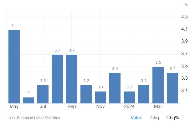
Annual inflation rate in the US eased to 3.4% in April 2024 from 3.5% in March which was the highest reading since September, in line with market forecasts. Inflation steadied for food (2.2%) and slowed for shelter (5.5% vs 5.7%) while prices continued to decline for new vehicles (-0.4% vs -0.1%) and used cars and trucks (-6.9% vs -2.2%). On the other hand, energy costs rose slightly more (2.6% vs 2.1% in March), with gasoline increasing 1.1% (vs 1.3%) while a decline was seen for utility gas service (-1.9% vs -3.2%) and fuel oil (-0.8% vs -3.7%). Also, cost rose faster for transportation (11.2% vs 10.7%) and apparel (1.3% vs 0.4%). Compared to the previous month, the CPI increased by 0.3%, below 0.4% in each of the previous two months and forecasts of 0.4%. Meanwhile, core inflation slowed to 3.6% annually, be the lowest reading since April 2021, down from 3.8% in both March and February. The monthly rate also eased to 0.3% from 0.4%, both in line with forecasts.
Eurozone Economic Growth & Inflation
Year-over-Year GDP growth
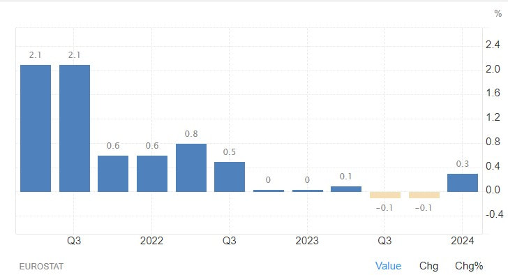
The Eurozone's GDP expanded by 0.4% from the corresponding quarter of the previous year, well above market estimates of a 0.2% expansion, and gaining traction following two quarters of 0.1% growth. GDP Annual Growth Rate in Euro Area averaged 1.59 percent from 1995 until 2024, reaching an all time high of 14.90 percent in the second quarter of 2021 and a record low of -14.10 percent in the second quarter of 2020.
Quarter-over-Quarter GDP growth
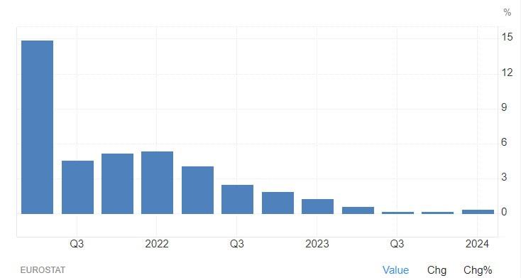
The Eurozone’s economy expanded by 0.3% in the first quarter of 2024, the fastest growth rate since the third quarter of 2022, to beat market expectations of a marginal 0.1% expansion and gain traction following muted readings since the fourth quarter of 2022. The result added leeway for the European Central Bank to refrain from cutting rates to a larger extent this year should inflationary pressures prove to be more stubborn than previously expected. Among the currency bloc’s largest economies, both the German and the French GDPs expanded by 0.2%, while that from Italy grew by 0.3% and that from Spain expanded by 0.7%, all above market estimates. Compared to the same quarter of the previous year, the Eurozone’s GDP grew by 0.4%, beating market expectations of 0.2%, and gaining traction after two straight quarters of 0.1% growth.
Annualized Inflation
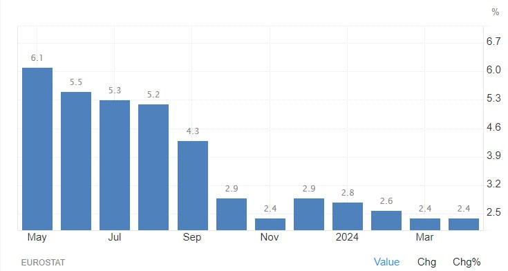
The annual inflation rate in the Euro Area remained at 2.4 percent in April 2024, in line with market expectations, preliminary estimates showed. Inflation slowed for non-energy industrial goods (0.9 percent vs 1.1 percent in March) and services (3.7 percent vs 4 percent). On the other hand, prices rose faster for food, alcohol, and tobacco inflation (2.8 percent vs 2.6 percent). Meanwhile, energy prices decreased at a slower pace (-0.6 percent vs -1.8 percent). On a monthly basis, consumer prices rose by 0.4 percent in April. The core inflation rate, a crucial underlying measure that filters out volatile food and energy prices cooled to 2.7 percent, down from March's 2.9 percent.
Japan Economic Growth & Inflation
Year-over-Year GDP growth
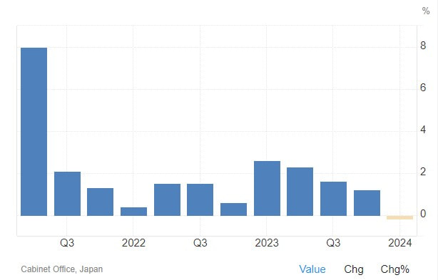
The Gross Domestic Product (GDP) in Japan contracted 0.20 percent in the first quarter of 2024 over the same quarter of the previous year. GDP Annual Growth Rate in Japan averaged 1.74 percent from 1981 until 2024, reaching an all time high of 9.40 percent in the first quarter of 1988 and a record low of -9.70 percent in the second quarter of 2020.
Quarter-over-Quarter GDP growth
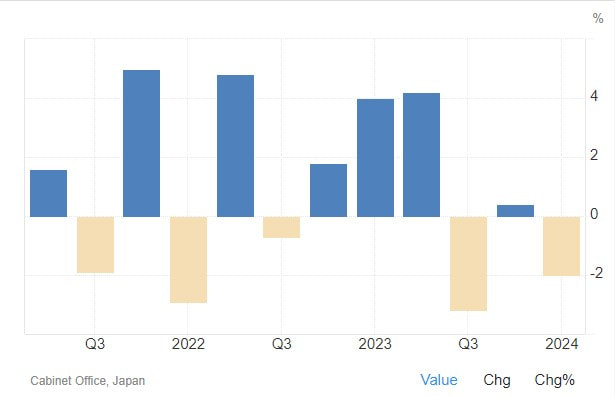
The Japanese economy contracted 2.0% in Q1 of 2024, compared with the market consensus of a 1.5% decline and after showing no growth in a downwardly revised figure during the previous period, a preliminary reading showed. Private consumption remained weak, declining for the fourth consecutive quarter and pointing to the steepest decline in three quarters, due to intense price pressure, languishing wage growth, and the impact of an earthquake on the first day of the year. In addition, business spending slumped after growing robustly in the prior quarter, a reflection that companies were reluctant to invest following a scandal at Toyota's compact car unit Daihatsu that caused a suspension of output and shipments. Further, external demand deteriorated, with exports falling faster than imports. That's compared with a positive contribution from net trade in the previous period. Conversely, government spending rose after declining in the final quarter of last year.
Annualized Inflation
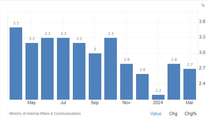
The annual inflation rate in Japan ticked lower to 2.7% in March 2024 from February's 3-month peak of 2.8%, matching market consensus. There were slowdowns in prices of transport (2.9% vs 3.0% in February), clothes (2.0% vs 2.6%), furniture & household utensils (3.2% vs 5.1%), healthcare (1.5% vs 1.8%), communication (0.2% vs 1.4%), and culture & recreation (7.2% vs 7.3%). At the same time, inflation was stable for food (at 4.8%), housing (at 0.6%), education (at 1.3%), and miscellaneous (at 1.1%). Meanwhile, prices of fuel, and light dropped the least in a year (-1.7% vs -3.0%), with electricity (-1.0% and -2.5%) and gas (-7.1% vs -9.4%) falling at softer paces as energy subsidies from the government would fully end in May. The core inflation rate fell to 2.6% from a four-month top of 2.8%, slightly below forecasts of 2.7%. Monthly, consumer prices rose by 0.2% in March, the most since last October, after being flat in the prior two months.
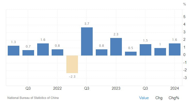
China Economic Growth & Inflation
Year-over-Year GDP growth
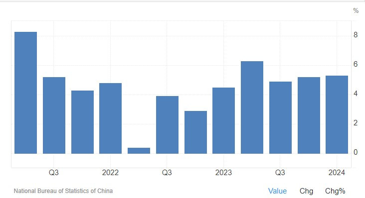
The Chinese economy advanced 5.3% yoy in Q1 of 2024, exceeding market forecasts of 5.0% and following a 5.2% growth in the prior period. It was the steepest yearly expansion since Q2 of 2023, lifted by continued support measures from Beijing and spending related to the Lunar New Year festival. During the first three months of 2024, fixed investment grew by 4.5%, the most in nearly a year and above the consensus of 4.3%. Meanwhile, the statistics agency said the economy had made a good start, delivering a strong foundation for achieving the GDP growth target of around 5% this year. However, March data showed that industrial output and retail sales rose less than estimated, underscoring that more policy easing remains necessary for the economy. At the same time, the surveyed jobless rate came at 5.2% in March, staying near February's 7-month high of 5.3%. Tuesday's release did not include China's youth unemployment rate, which hit a record high of 21.3% in June 2023.
Quarter-over-Quarter GDP growth
The Chinese economy grew by a seasonally adjusted 1.6% in Q1 of 2024, quickening from an upwardly revised 1.2% increase in the previous quarter. It was the seventh consecutive period of quarterly expansion and the strongest advance since Q1 of 2023, mainly reflecting the Spring festival effects. Additionally, the country's statistics agency noted that the industry had performed better than expectations, as highlighted by recent data on official PMIs. It added that recovery in the economy will continue as Beijing intends to strengthen the implementation of macro policies and pursue high-quality development. On the monetary front, the People's Bank of China (PBoC) has pledged to ramp up policy support this year, with many analysts forecasting further cuts in banks' RRR and interest rates. The central bank also might include the buying and selling of treasury bonds in its policy tool reserve in the future.
Annualized Inflation
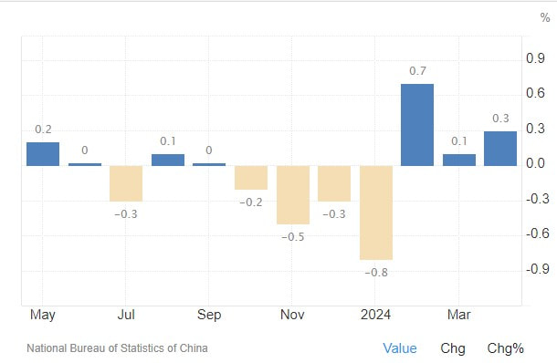
China's annual inflation rate rose to 0.3% in April 2024, compared with market estimates and March's figure of a 0.1%. It was the third straight month of consumer inflation, amid ongoing recovery in domestic demand despite a fragile economic revival. Non-food inflation accelerated (0.9% vs 0.7% in March), with prices rising further for clothing (1.6% vs 1.6%), housing (0.2% vs 0.2%), health (1.6% vs 1.5%), and education (1.8% vs 1.8%). At the same time, transport cost added 0.1% after falling 1.3% in the prior month, as some local governments recently have been raising utility prices, such as natural gas, and train fares. On the food side, prices continued to fall, marking the 10th consecutive month of decrease (-2.7% vs -2.7%). The core consumer prices, deducting food and energy prices, increased by 0.7% yoy in April, compared with a 0.6% rise in March. Monthly, the CPI increased by 0.1%, a reversal from a 1.0% fall in March which was the steepest decline in three years.
Valuation Model
The Valuation model is currently YELLOW. Equity valuations are currently near the upper region of "fair value" relative to underlying current global economic fundamentals.
Technical Model
The Technical model is currently GREEN. Global equity markets have been in a trending advance since Oct 2023 following their Jul-Oct/23 correction.
Sentiment Model
The Sentiment model is currently YELLOW. Overall sentiment has turned neutral (sentiment acts as an inverse shorter-term trading indicator).
Liquidity/Economic Stress Model
The Liquidity/Economic Stress model is currently GREEN. Steady and improving global economic growth continues to offset global central bank liquidity tightening.
World Bond Asset Class Return Monitor
We use the following U.S. exchange traded funds to monitor bond performance for the various bond asset classes:
Total Market Bond Basket:
- U.S. Total Bond Market (BND): (Red)
- International (ex-U.S.) Total Bond Market (BNDX): (Blue)
- U.S. Gov't Treasury Bonds (GOVT): (Orange)
- Foreign Developed Market Gov't Treasury Bonds (BWX): (Pink)
- U.S. Corporate Bonds (LQD): (Maroon)
- International Corporate Bonds (PICB): (Black)
- U.S. High Yield Bonds (JNK): (Purple)
- International High Yield Bonds (IHY): (Green)
- U.S. Gov't Inflation Protected Bonds (TIP): (Lime Green)
- International Gov't Inflation-Protected Bonds (WIP): (Cyan)
1 Year Rolling Bond Performance
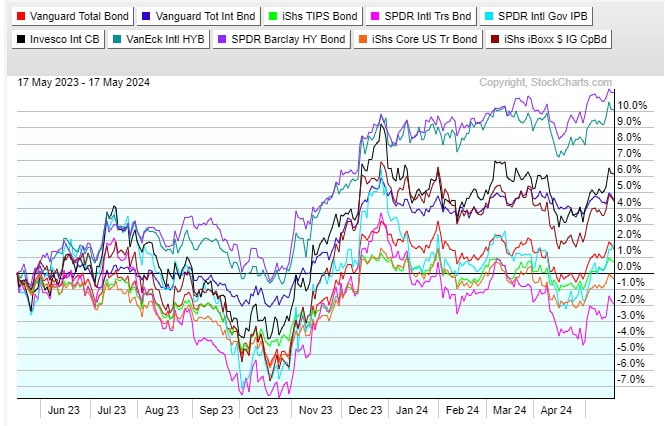
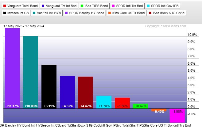
- Over the past 12 months rolling period the top performing bond asset class has been US High Yield Bonds with Int'l Gov't Treasury Bonds the worst performing.
- The U.S. Total Bond Market (RED) and the International (ex-U.S.) Total Bond Market (BLUE) have delivered positive returns over the past year.
3 Month Rolling Bond Performance
- Over the past 3 month rolling period the top performing bond asset class has been US High Yield Bonds with Int'l Gov't Treasury Bonds lagging.
- U.S. Total Bond Market (RED) and International (ex-U.S.) Total Bond Market (BLUE) have delivered positive returns over the past quarter (3 months).
1 Month Rolling Bond Performance
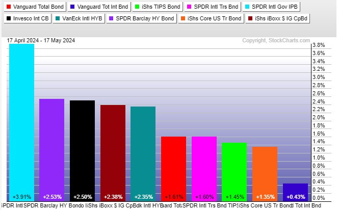
- Over the past 1 month rolling period the top performing bond asset class has been Int'l Gov't Inflation-Protected Bonds with US Gov't Treasury Bonds lagging.
- The U.S. Total Bond Market (RED) and the International (ex-U.S.) Total Bond Market (BLUE) have delivered positive returns over the past month.
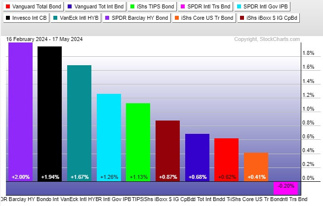
Past Week Bond Asset Class Performance
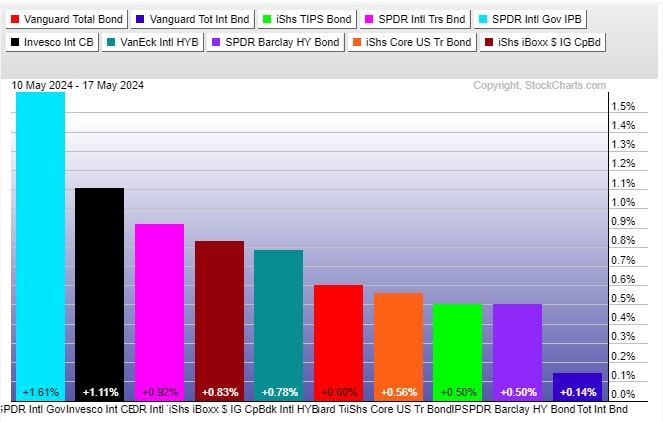
- Over the past week Int'l Gov't Inflation Protected Treasury Bonds were the top performing bond class.
- The U.S. Total Bond Market (RED) and the International (ex-U.S.) Total Bond Market (BLUE) posted positive returns over the past week.
Commentary:
It has been shown in repeated studies over many years a balanced portfolio consisting of both equities and bonds (with percentage holdings in each adjusted according to personal risk tolerances) remains the best methodology in managing a long term retirement portfolio (due to the independent/low correlated function each takes when navigating though various market cycles and economic conditions).
It is best to think of bonds and equities as 2 independent brains each looking at the market from a different perspective:
As such, historically both serve a useful purpose in a balanced portfolio.
It is best to think of bonds and equities as 2 independent brains each looking at the market from a different perspective:
- Equities: Corporate profits focused.
- Bonds: Economic growth and Inflation focused.
As such, historically both serve a useful purpose in a balanced portfolio.
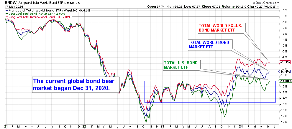
ETF Bond Proxies
Global aggregate bonds posted a gain of +0.40% over the past week. They had been rangebound in 2024 within a narrow trading range. They closed the week at support and above the 52 week moving average.
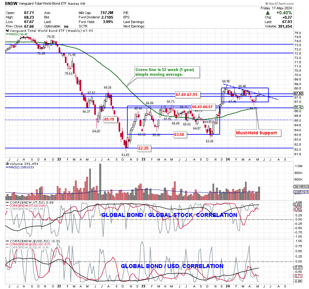
The current bond bear market began 31 Dec 2020. Below is the performance of the 3 ETF's we use as "bond proxies" from that date to monitor global bond performance:
- BNDW: Vanguard Total World Bond market ETF (BLUE)
- BND: Vanguard Total U.S. Bond market ETF (GREEN)
- BNDX: Vanguard Total International (ex-U.S.) Bond market ETF (RED)
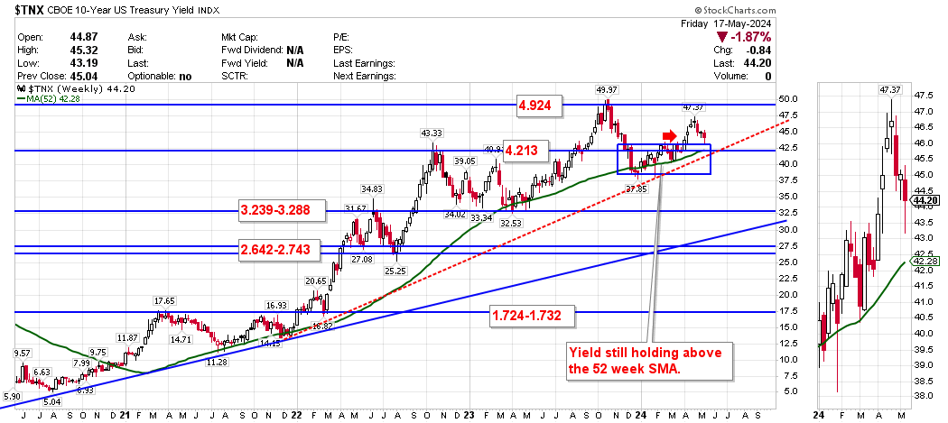
U.S. 10 year Treasury Yield
The most recent global bull market in bonds began in mid-1981 when the US Federal Reserve pushed interest rates to > 20% to combat inflation. Below is charts for the various US Treasury yields from their peak (bond prices move inverse to yields so falling treasury yields are bullish for bond prices).
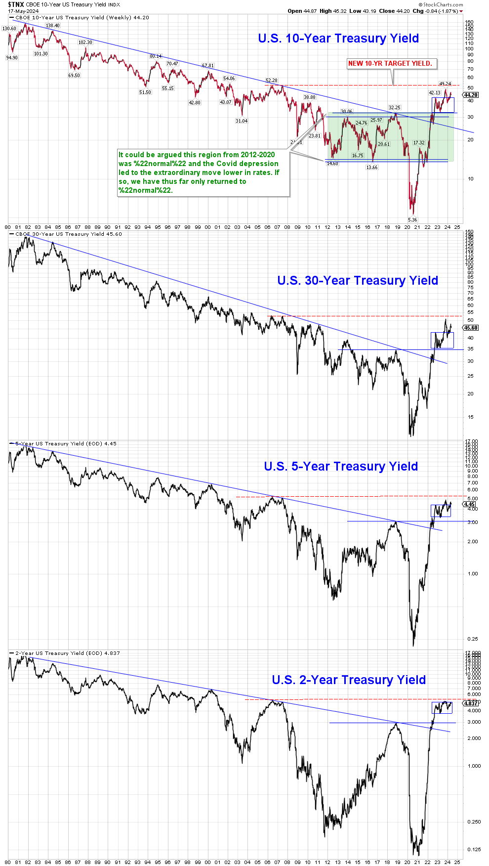
U.S. treasury yields rose in a parabolic manner into Oct, 2023 before their recent decline. This past week yields closed above support @ 4.213% and remain above the 52 week moving average.
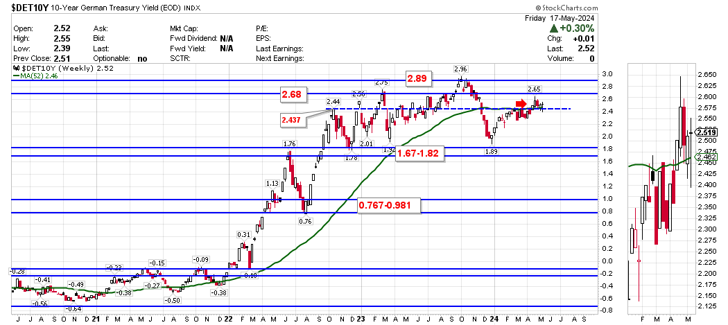
German 10 year Bund Yield
German 10 year treasury yields bottomed in early 2020 during the depths of the European Covid shutdowns. They rebounded in a parabolic manner into Oct, 2023 before their recent decline. This past week yields closed above resistance @ 2.437% and above the 52 week moving average.
Japanese 10 year Treasury Yield
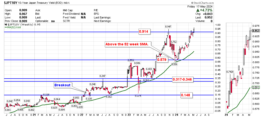
Japan has been fighting deflation for decades and only recent unprecedented monetary policy by the BOJ appears to be having some effect upon deflation (and yields).
After bottoming at near -0.28% in mid-2016, yields have risen and were able to finally break above 0.15% in early 2022. They are currently employing yield curve control (YCC) to keep rates pegged below 1.0% (increased from 0.5% in Jul/2023). This past week yields closed above support @ 0.579% and remain above the 52 week moving average.
After bottoming at near -0.28% in mid-2016, yields have risen and were able to finally break above 0.15% in early 2022. They are currently employing yield curve control (YCC) to keep rates pegged below 1.0% (increased from 0.5% in Jul/2023). This past week yields closed above support @ 0.579% and remain above the 52 week moving average.
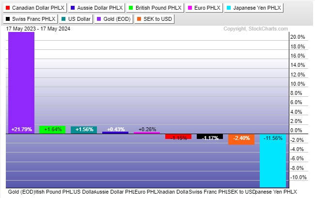
Currencies
Below is the 12/3/1 month and weekly rolling returns for the 6 currencies that make up the U.S. Dollar index. The U.S. Dollar index is composed of a weighted geometric mean of the dollar's value relative to the 6 currencies in the following list:
In addition, we also include the following for comparison purposes:
- Euro (EUR), 57.6% weight.
- Japanese yen (JPY) 13.6% weight.
- U.K. Pound sterling (GBP), 11.9% weight.
- Canadian dollar (CAD), 9.1% weight.
- Swedish krona (SEK), 4.2% weight.
- Swiss franc (CHF) 3.6% weight.
In addition, we also include the following for comparison purposes:
- The Australian Dollar (not a part of the USD Index) as it is a popular commodity currency.
- Gold (priced in USD) as it typically acts more like a currency void of fiat printing.
1 Year Rolling Currency Performance
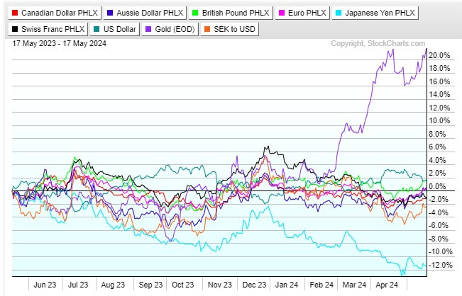
- Over the past 12 months rolling period the top performing major currency has been Gold with the Japanese Yen the worst performing.
3 Month Rolling Currency Performance
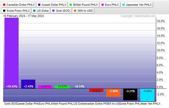
- Over the past 3 month rolling period the top performing currency has been Gold with the Japanese Yen lagging.
1 Month Rolling Currency Performance

- Over the past 1 month rolling period the top performing currency has been the Australian Dollar with the US Dollar Index lagging.
Past Week Currency Performance
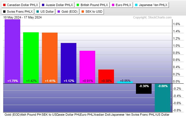
- Over the past week the top performing major currency was Gold with the US Dollar Index lagging.
U.S. Dollar: (Bullish Bias)
Commentary:
The USD was down -0.80% over the past week. It had been confined to a 7-month consolidation range before breaking lower in July but has returned back to the previous range.
Support / Resistance Levels (based upon respective time period closing price):
Weekly: 102.95 / 106.43
Monthly: 101.03 / 106.43
Support / Resistance Levels (based upon respective time period closing price):
Weekly: 102.95 / 106.43
Monthly: 101.03 / 106.43
US Dollar Index Daily charts

The 2 year daily chart (above) shows the steady up-trend starting from its May 2021 lows into Oct 2022. It experienced a sharp decline into Feb 2023 and has remained rangebound.
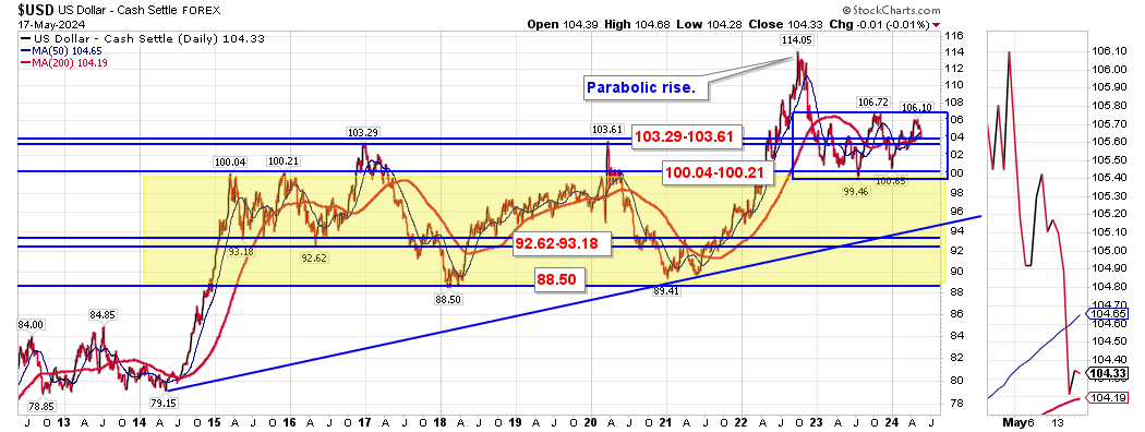
The 10 year daily chart (above) shows the price break below 103.29-103.61 which was daily support on pullbacks. Support is now 100.04-100.21.
Over the past week the USD closed between its short term trend 50 and 200 day moving averages.
(Short Term Neutral)
(Short Term Neutral)
US Dollar Index Weekly charts
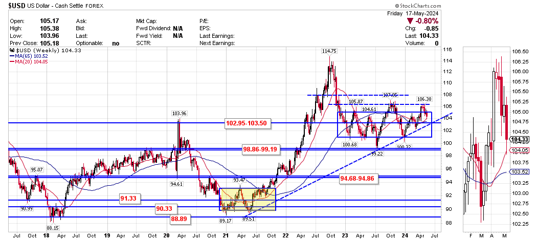
The weekly chart shows the recent trading range since late 2023. Price is currently challenging the top end of the range.
Price closed the week above the intermediate term trend 20 and 65 week moving averages.
(Intermediate Term Bullish)
Price closed the week above the intermediate term trend 20 and 65 week moving averages.
(Intermediate Term Bullish)
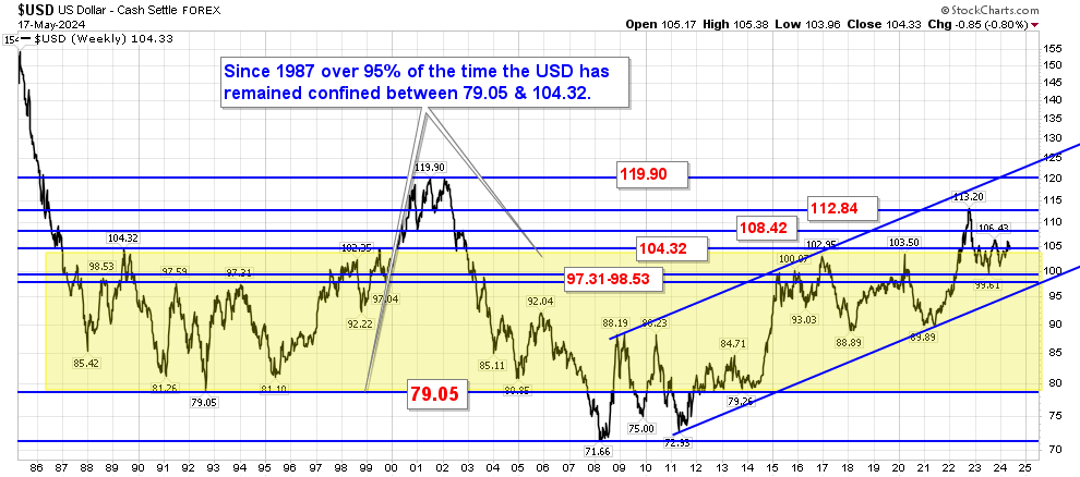
A longer term 20 year look-back at the USD shows the 79.05-104.32 price (yellow) area has been a very significant bull/bear battle zone since 1986. Price this week closed marginally above this level.
US Dollar Index Monthly chart

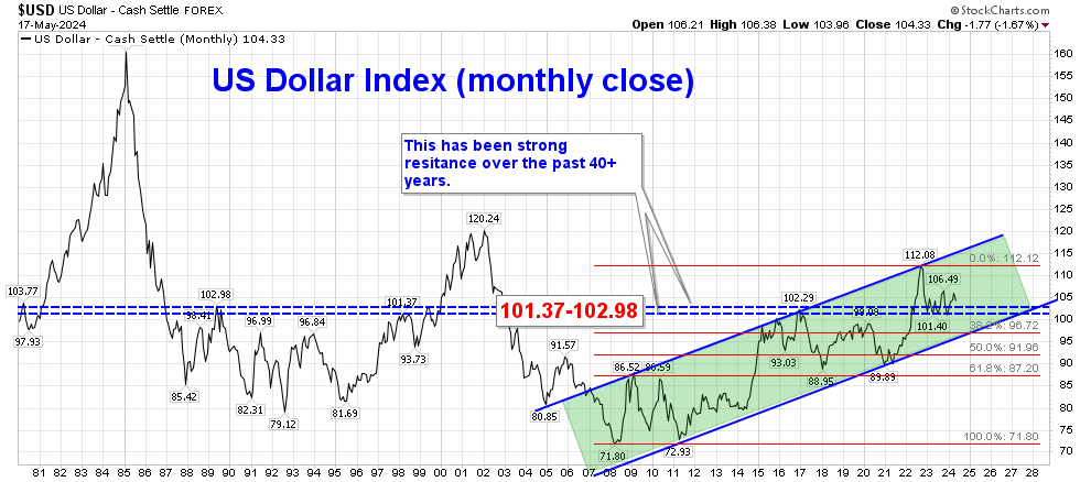
For the month of May the U.S. Dollar index has lost -1.67%. Price remains confined to the rising price channel from the 2011 lows and remains confined to a 16 month consolidation zone between 101.03-106.49.
Price closed March above the long term trend 10 month moving average keeping the long term bias to Bullish until months end.
(Long Term Bullish)
Price closed March above the long term trend 10 month moving average keeping the long term bias to Bullish until months end.
(Long Term Bullish)
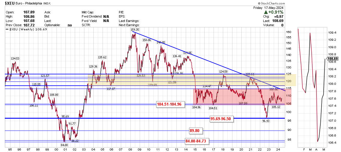
Euro (Neutral Bias)
The Euro was up +0.91% over the past week. It has remained largely range bound between 105-112 over the past year.
Support / Resistance Levels (based upon respective time period closing price):
Weekly: 108.46 / 112.32
Monthly: 105.25 / 114.27
Support / Resistance Levels (based upon respective time period closing price):
Weekly: 108.46 / 112.32
Monthly: 105.25 / 114.27
Euro Daily Charts

The Euro topped out in early 2018 @ 125.10 and had been on a steady decline until March 2020. It rose dramatically into the end of 2020 had remained range bound in 2021 until its recent breakdown.
On the 2nd daily chart price it can be seen how important the yellow band daily resistance zone @ 114.61-116.04 is going back to 2015. Other areas of daily support/resistance are seen at 108.24-108.66 and 103.90-105.69.
The Euro closed the week above the short term trend 50 and 200 day moving averages.
(Short Term Bullish)
Euro Weekly Chart
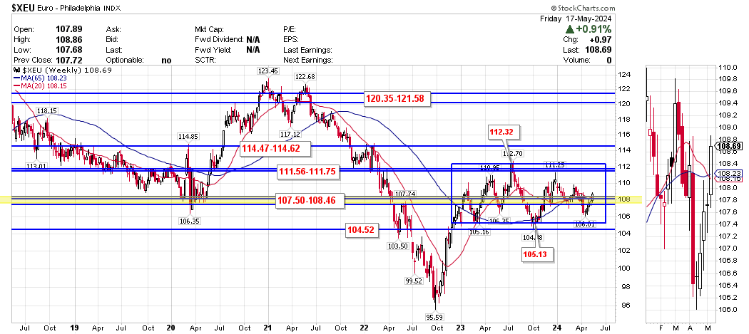
The Euro peaked in 2008 and achieved a bottom in 2022. It has been on a steady decline but recently broke above important resistance @ 104.51-104.96 (which now should act as support).
This past week the Euro closed the week above the intermediate trend 20 week + 65 week moving averages.
(Intermediate Term Bullish)
This past week the Euro closed the week above the intermediate trend 20 week + 65 week moving averages.
(Intermediate Term Bullish)
Euro Monthly
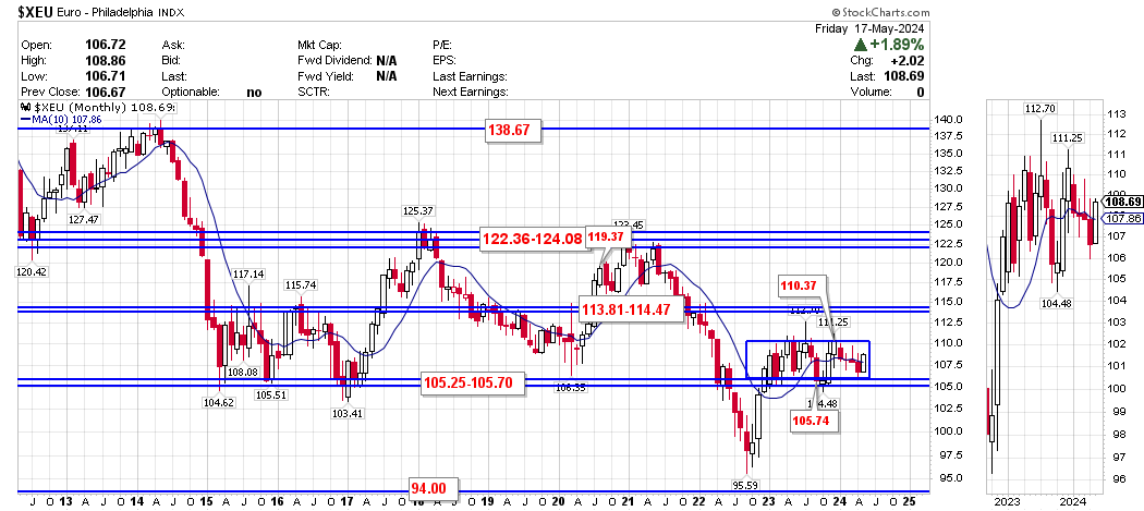
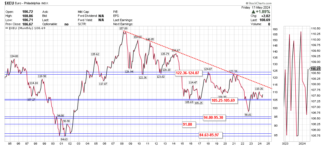
For the month of May the Euro has gained +1.89%. On a monthly closing basis it closed the month of April below the long term trend 10 month moving average keeping the long term outlook bearish until months end.
(Long Term Bearish)
(Long Term Bearish)
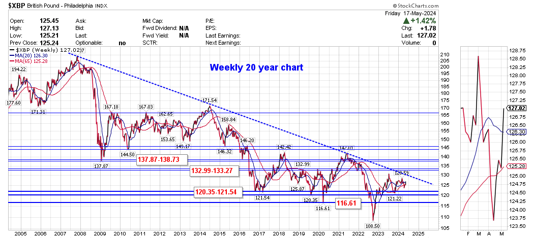
UK Pound (Neutral Bias)
U.K. Pound Daily Charts
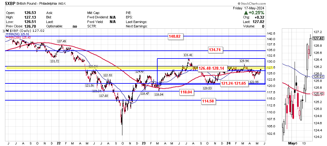
U.K. Pound Weekly Charts
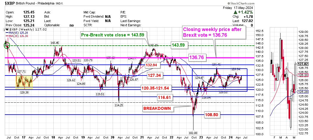
U.K. Pound Monthly Charts
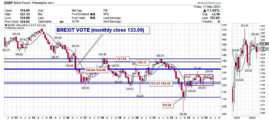
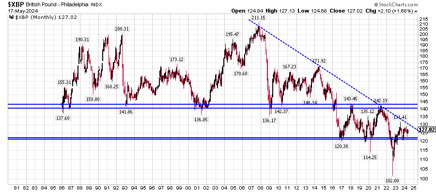
The British Pound was up +1.42% over the past week. It continues to recover from lows last seen 37 years ago. Historically since 1987 the Pound has traded within a range of 1.40 to 2.00 with brief excursions above/below this range. The previous all-time low over the past 200 years was 1.0520 (daily low @ 1.0438) seen in the 1st quarter of 1985 which was revisited in September 2022 (close 1.0696 27 Sep 2022).
This past week the Pound closed the week above its short term trend daily 50 +200 day moving averages and above the intermediate term trend 20 + 65 week moving averages. For the month of May it has gained +1.68% and closed the month of April below its long term 10 month moving average (which technically switches the long term bearish until months end).
(Short Term Bullish)
(Intermediate Term Bullish)
(Long Term Bearish)
Support / Resistance Levels (based upon respective time period closing price):
Weekly: 121.54 / 131.43
Monthly: 121.33 / 133.09
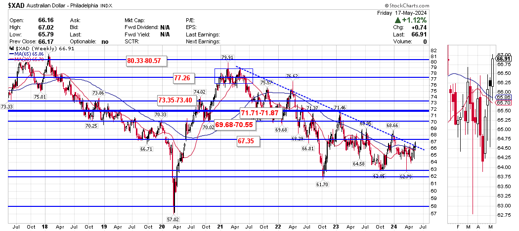
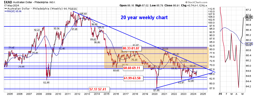
Australian Dollar (Bullish Bias)
Australian Dollar Daily Chart
Australian Dollar Weekly Charts
Australian Dollar Monthly Chart
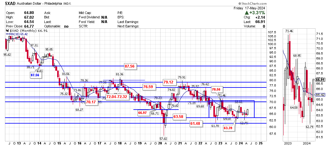
The Australian Dollar gained +1.12% over the past week. It topped in Apr/2021 and has been on a steady downtrend to present.
For the month of May the Aussie dollar has gained +3.31%. It closed the week above the short term trend 50 + 200 day moving averages and above the intermediate term trend 20 + 65 week moving averages. It closed the month of April below the long term trend 10 month moving average keeping the long term outlook bearish until months end.
(Short Term Bullish)
(Intermediate Term Bullish)
(Long Term Bearish)
Support / Resistance Levels (based upon respective time period closing price):
Weekly: 61.99 / 69.11
Monthly: 63.58 / 70.17
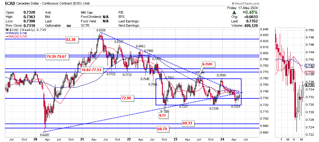
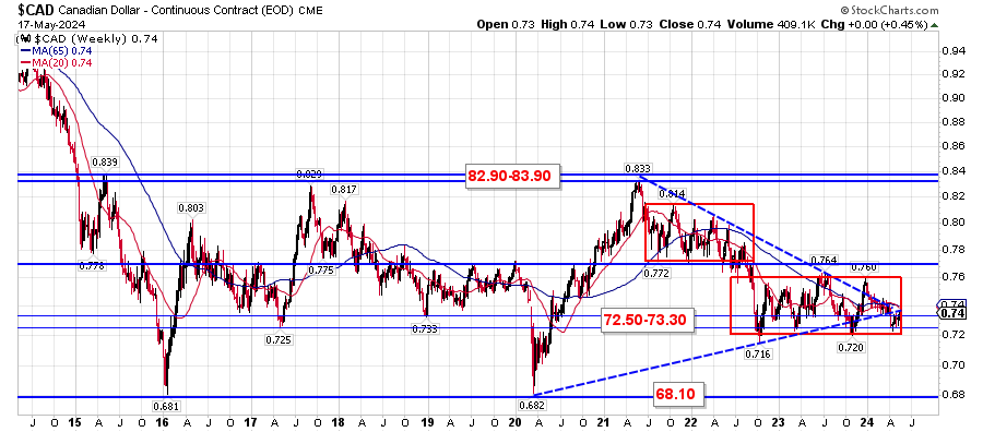
Canadian Dollar (Bearish Bias)
Canadian Dollar Daily Chart

Canadian Dollar Weekly Chart
Canadian Dollar Monthly Chart
The Canadian dollar gained +0.45% over the past week and continues to recover off its Covid-lows of late March 2020 (it is largely tied to the price of commodities so the anticipated global recovery has benefited CAD).
The Loonie closed the week between the short term trend 50 + 200 day moving averages and below the intermediate term trend 20 + 65 week moving averages. For the month of May the Loonie has gained +1.10%. It closed the month of April below the long term trend 10 month moving average keeping the long term bearish until months end.
(Short Term Neutral)
(Intermediate Term Bearish)
(Long Term Bearish)
Support / Resistance Levels (based upon respective time period closing price)
Weekly: 72.96 / 75.91
Monthly: 72.17 / 75.95
Key Weekly Returns (week ending 17 May 2024):
|
Countries/Regions
World Equities ACWI (iShares MSCI ACWI Index Fund) North American Equities SPY (S&P 500 SPDRs) QQQ (PowerShares QQQ Trust) IWM (Russell 2000 iShares) EWC (Canada iShares) |
Characteristics
Global Equity Fund U.S. Large Cap S&P 500 Index U.S. NASDAQ 100 Fund U.S. Russell 2000 Small Cap Fund Canada |
Week % Change
+1.80% +1.65% +2.19% +1.85% +1.06% |
Non-North America Equities
|
VGK (Vanguard European VIPERs) EPP (iShares MSCI Pacific ex-Japan ) EWJ (Japan iShares) EEM (iShares MSCI Emerging Markets) ILF (Latin America 40 Index iShares) Bonds
BND (Vanguard Total U.S. Bond Market) BNDX (Vanguard International Bond ETF) TIP (iShares Barclays TIPS Bond Fund) PCY (PowerShares Emerging Markets Debt Portfolio) |
Europe/U.K Pacific ex-Japan (inc. Australia + NZ) Japan Emerging Markets Latin America US Total Bond (44% Gov't Tsy, 56%Corp) World Investment Grade Bonds ex-US Inflation Protected Gov't Bonds Emerging Market Sovereign Debt |
+1.67% +3.29% +1.15% +3.04% +0.21% +0.60% +0.14% +0.50% +1.21% |
|
Commodities
DBC (DB Commodities Tracking Index Fund) DBA (PowerShares DB Agriculture Fund) GLD (SPDR Gold Trust Shares) SLV (iShares Silver Trust) DBB (PowerShares Metals Fund) USO (United States Oil Fund) |
Commodity Basket Soft Commodity Basket Gold Bullion Silver Bullion Industrial Metals Light Crude Oil |
+1.85% -4.78% +2.26% +11.72% +4.99% +2.22% |
Currencies
|
UUP (PowerShares DB US Dollar Bullish Fund)
FXA (Currency Shares Australian Dollar Trust) FXB (Currency Shares British Pound Sterling Trust) FXC (Currency Shares Canadian Dollar Trust) FXE (Currency Shares Euro Trust) FXY (Currency Shares Japanese Yen Trust) |
U.S. Dollar
Australian Dollar U.K. Sterling Canadian Dollar Euro Japanese Yen |
-0.63%
+1.42% +1.45% +0.51% +0.97% +0.17% |
Important Charts to Watch
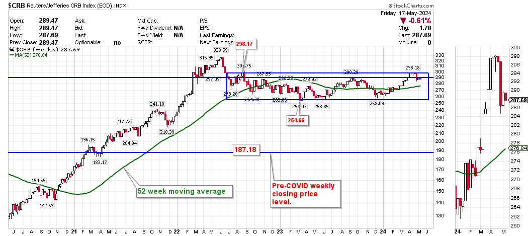
Commodity Basket Index
Commodities (as measured by the Reuters/Jefferies CRB index, a basket of 19 commodities) bottomed in April, 2020 and peaked in June, 2022. They were highly impacted by the Covid pandemic actions and have been attempting to stabilize near 8 year highs.
Resistance remains @ 298.17 with support @ 254.66. Commodity prices strong influence inflation so the recent consolidation near its peak is indicative of lingering global inflationary pressures post-Covid.
Resistance remains @ 298.17 with support @ 254.66. Commodity prices strong influence inflation so the recent consolidation near its peak is indicative of lingering global inflationary pressures post-Covid.
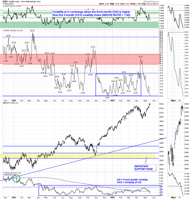
Equity Market Volatility
The Volatility Index (VIX) is a measure of expected price fluctuations of options on the S&P 500 index options over the next 30 days (technically the VIX is quoted in percentage points and represents the expected range of movement in the S&P 500 index over the next year, at a 68% confidence level i.e. one standard deviation of the normal probability curve). For example, if the VIX is 15, this represents an expected annualized change, with a 68% probability, of less than 15% up or down.
In general it can be said there are four VIX volatility regimes:
The VXV uses the same calculation as the VIX but looks forward 3 months. When the VIX is greater than the VXV ($VIX:$VXV ratio > 1.0) the volatility structure is termed to be in "contango". It indicates traders are much more concerned about short term volatility than they are about longer term volatility and when that ratio returns to "normal" (< 0.93) it is typically a good sign market stress is easing (and a good time to add to equity positions).
As of this weeks market close volatility closed below the "VIX Event End Line" area with the VIX below 20. The volatility structure is currently BULLISH for equities.
In general it can be said there are four VIX volatility regimes:
- < 20 is trending bullish for equities
- ≈ 20-25 is choppy bullish for equities
- ≈ 25-30 is choppy bearish for equities
- > 30 is trending bearish for equities
The VXV uses the same calculation as the VIX but looks forward 3 months. When the VIX is greater than the VXV ($VIX:$VXV ratio > 1.0) the volatility structure is termed to be in "contango". It indicates traders are much more concerned about short term volatility than they are about longer term volatility and when that ratio returns to "normal" (< 0.93) it is typically a good sign market stress is easing (and a good time to add to equity positions).
As of this weeks market close volatility closed below the "VIX Event End Line" area with the VIX below 20. The volatility structure is currently BULLISH for equities.
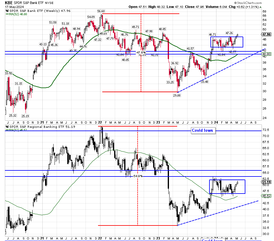
Global Banks
Up until recently US banks were thought to be quite stable. However, several recent failures have now brought US banks into focus. Below is a chart of the KBE (US Bank ETF) and KRE (US Regional Bank ETF). We are watching closely for further signs of stress following the recent declines.
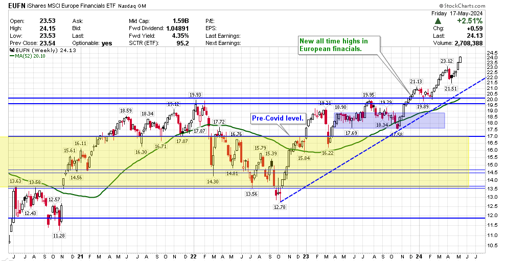
Since the 2009 market bottom Europe has been the weakest major equity growth region. As such, we continue to monitor European financial stocks (represented below using the iShares MSCI European Financials ETF).
European financials bottomed in March, 2022 and have been very strong.
European financials bottomed in March, 2022 and have been very strong.
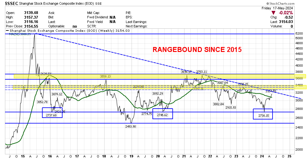
Chinese Equities
The Shanghai Composite index was flat over the past week and remains above support @ 2715-2820. It remains near 5-year lows.
Chinese growth remains key to both Emerging market performance as well as an indication of Developed markets demand. From its peak in mid-2015, the Shanghai index lost more than -50% to its recent lows. We would like to see significant strength return to China further indicating world economic growth has positively turned the corner.
Chinese growth remains key to both Emerging market performance as well as an indication of Developed markets demand. From its peak in mid-2015, the Shanghai index lost more than -50% to its recent lows. We would like to see significant strength return to China further indicating world economic growth has positively turned the corner.
PRECIOUS METALS
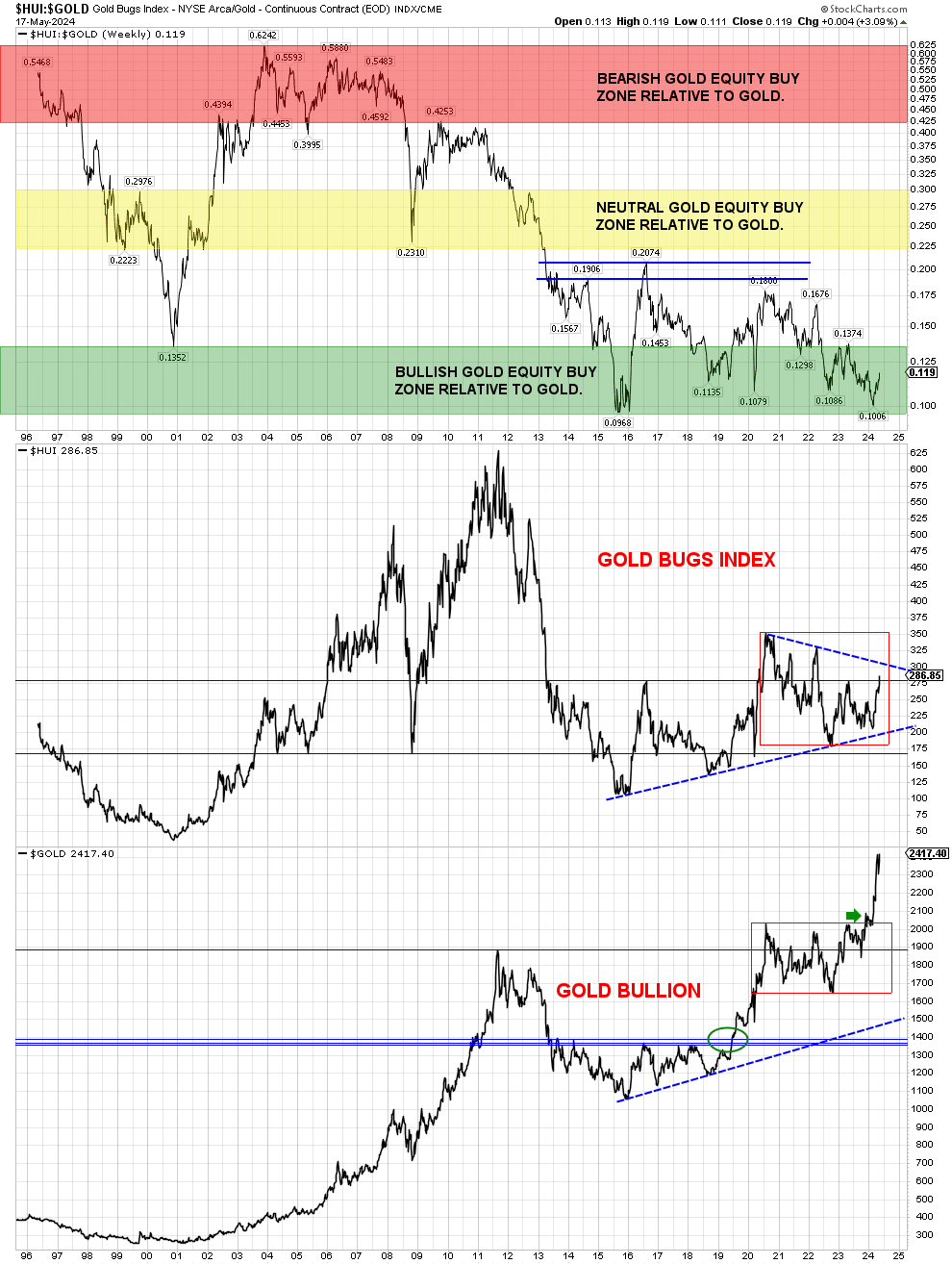
Precious metals (and their respective producers) are an area we recommend all investors consider having a small position within. Precious metals perform well during times when real (inflation adjusted) interest rates are falling and/or when the USD is weak. The following charts can be utilized to determine when the risk/reward is favorable.
Below is a ratio price chart of gold stocks (HUI; the "Gold Bugs" Index) to gold bullion going back to 1996 when the Gold Bugs Index first came into existence. As can be seen, whenever the HUI:GOLD ratio dips to below approximately 0.14 (the GREEN zone on the chart) has been a low-risk opportunity to acquire gold stocks.
Gold stocks remain in the "low-risk vs. high-reward" range and until recently remain near their cheapest valuations in 8 years. Historically purchases of gold equities when within the green-zone have been a very good long term buy-and-hold opportunities.
Gold stocks remain in the "low-risk vs. high-reward" range and until recently remain near their cheapest valuations in 8 years. Historically purchases of gold equities when within the green-zone have been a very good long term buy-and-hold opportunities.
Equally bullish is Silver (chart below) which remains at a price ratio relative to the price of gold (GREEN zone on the chart) which has historically been a low risk entry point over the past 40 years.
Silver remains cheap relative to gold.
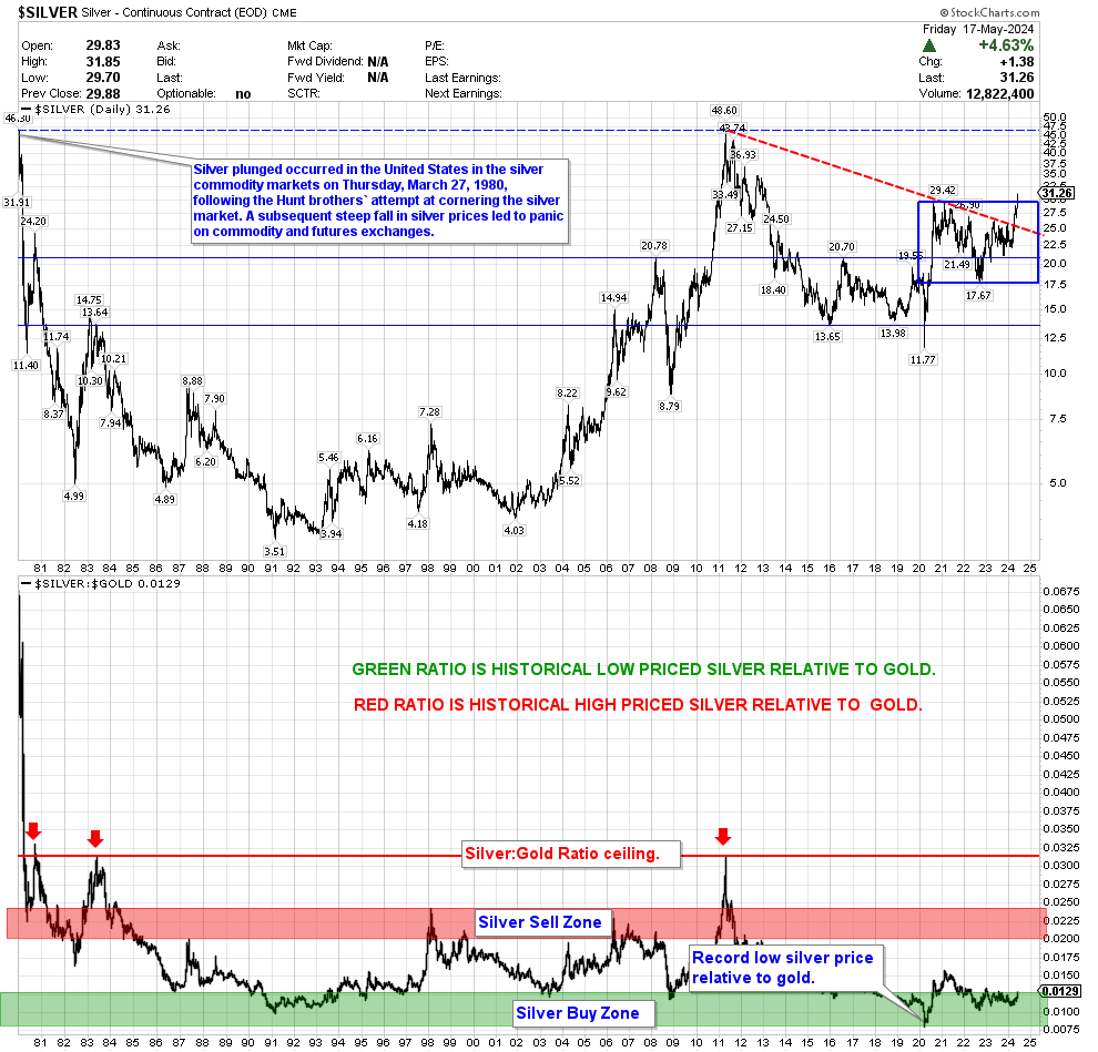
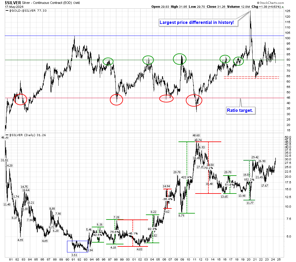
To put the valuation into a longer term perspective, below is a chart of the Gold/Silver ratio (the opposite ratio to Silver/Gold) going back to 1687. Clearly it can be seen a gold:silver ratio > 80 has historically been an outlier over the past 100+ years (and greater than 100 is historic):
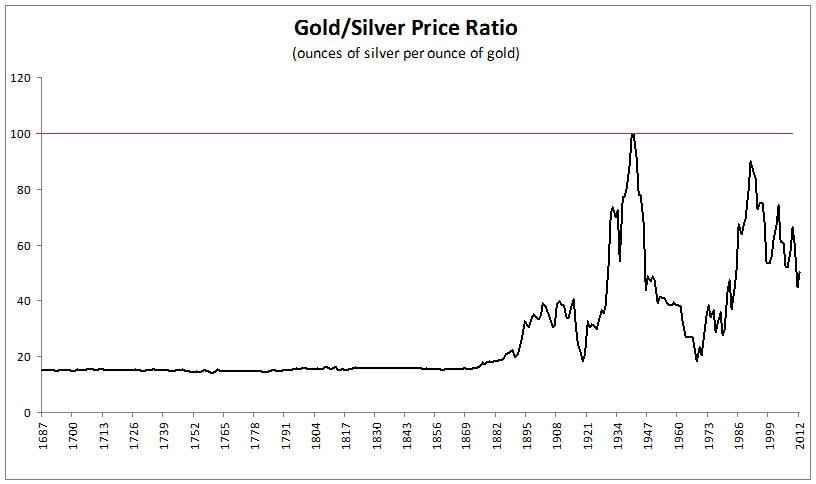
The current Gold:Silver ratio recently exceeded 120 for the 1st time in history and remains near the top end of 40 year highs. It can be seen each instance in the past 40 years where the ratio has crossed above 80 has resulted in very good long term gains in silver.
The move in Silver we have been anticipating appears to have begun but there remains plenty of room to allow the ratio to fall to the "sell" level near 45.
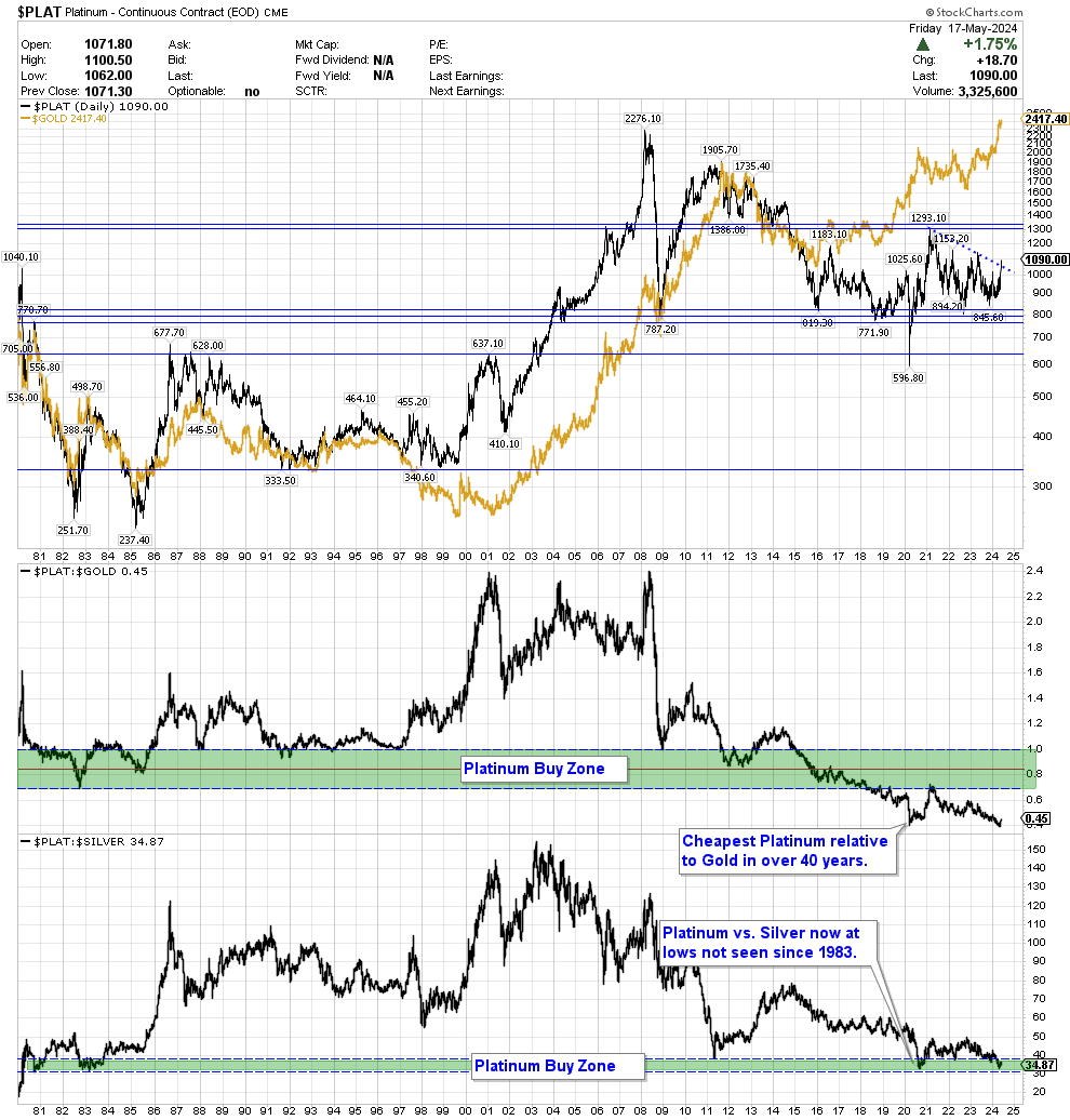
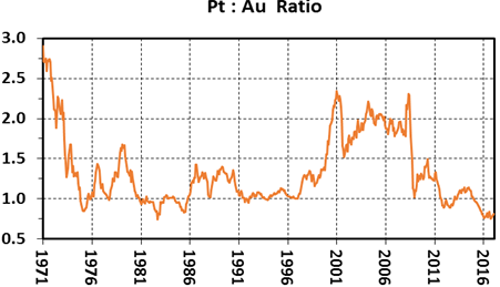
EVEN MORE BULLISH is the price of Platinum (chart below) which has exceeded the "buy zone" last seen in 1982! Platinum is 15-20 times rarer than gold and has rarely in history traded at a price below the price of gold (only 9.7% of the time going back to 1971). It is now the cheapest it has been GOING BACK TO AUGUST 1971 WHEN THE U.S. LEFT THE GOLD STANDARD on a relative basis:
- The current Platinum:Gold ratio remains below 0.85 (red line on the chart below).
- A Platinum/Gold ratio < 0.85 has only occurred 4.7% of the time back to 1971.
- Prior to recent lows, the lowest Platinum:Gold ratio since August 1971 (when the USD was removed from the gold standard) was hit on 20 Sept 1982 when it hit a ratio low of 0.689 (Platinum $300.40/Gold $436.00).
- If Platinum were to return to its most common ratio relative to Gold (1.0x-1.25x which has been common 35% of the time) it would imply a price rise of approximately 50-90% from recent levels.
Platinum now sits on a price support extending back to 2004 and, combined with its ratio relative to the price of gold, represents a compelling long term buy point.
The following charts and commentary (in italics; bold print is our emphasis) are sourced from Kitco from commentary sourced in Feb 2017 when the ratio was near 0.85 (Platinum has become even cheaper on a relative basis since the data was published):
Platinum to gold ratios show wide variance over the 46 year period ranging from highs above 2.5 before and soon after Nixon began taking the United States off the gold standard to periodic lows below 1.0:
Platinum to gold ratios show wide variance over the 46 year period ranging from highs above 2.5 before and soon after Nixon began taking the United States off the gold standard to periodic lows below 1.0:
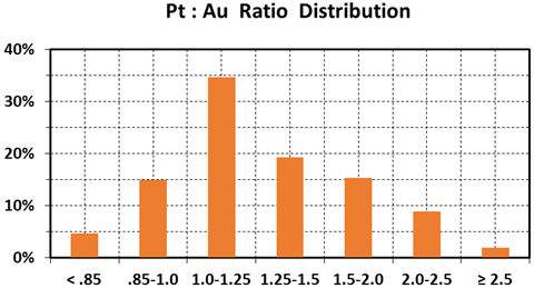
Our data set covers 553 months beginning in January 1971. The distribution of ratios in both tabular and chart format follows:
Platinum/Gold Ratio: % of Months
Platinum/Gold Ratio: % of Months
- < 0.85: 4.7%
- .85-1.01: 5.0%
- 1.0-1.25: 34.7%
- 1.25-1.5: 19.3%
- 1.5-2.0: 15.4%
- 2.0-2.5: 8.9%
- > 2.5: 2.0%
From our data set and the distributions of monthly average platinum-gold ratios from January 1971 thru January 2017, I glean the following:
From a compendium of sources, the average crustal abundance of both metals is around 4 ppb. Based solely on this fact, platinum and gold should trade at about the same price.
And indeed, our compilation shows that for nearly 50% of the time since gold was decoupled from the world’s reserve currency and allowed to trade freely on exchanges, the price ratio has ranged from 0.85 to 1.25. That said, since January 1971, the average price of platinum has been $637/oz and gold has been $518/oz for an overall ratio of 1.23:1. Clearly there are other factors other than the nearly equal crustal abundances that account for this historic price relationship.
A variety of supply and demand factors cause platinum to trade at a premium to gold:
Fluctuations in the relative prices of platinum and gold are largely driven by:
Platinum functions both as a precious and industrial metal. It is usually tied to the price of gold in both short- and long-term trading patterns. In times of financial distress and economic turmoil, platinum tends to behave more like gold with widespread hoarding.
The platinum-gold ratio can be used to ascertain whether one metal is over- or undervalued with respect to the other. The current monthly average ratio below 0.85 is unusual and indicates that platinum is severely undervalued with respect to gold *
* The ratio recently hit 0.55 and remains near a record low.
- A ratio of less than 0.75 is a single outlier that occurred once during the second half of 1982 when overall ratios averaged 0.81.
- Ratios <0.85 are quite unusual at 4.7%. They occurred for two months in the first quarter of 1975, the aforementioned six months in 1982, in June-July of 1985, and for an ongoing run of 16 months that commenced in October 2015.
- Ratios from 0.85 to 1.0 constitute 15.0% of the record.
- Pt:Au from 1.0 to 1.25 is the most common range and comprises 34.7% of ratios since 1971.
- The ratios between 1.25 and 1.5 occur 19.3% of the time.
- Ratios from 1.5 to 2.0 make up 15.4% of the record.
- The 2.0-2.5 interval covers 8.9% of the months in our compendium.
- The 11 monthly outliers at >2.5 comprise 2.0% of the total record and have not occurred since 1971.
From a compendium of sources, the average crustal abundance of both metals is around 4 ppb. Based solely on this fact, platinum and gold should trade at about the same price.
And indeed, our compilation shows that for nearly 50% of the time since gold was decoupled from the world’s reserve currency and allowed to trade freely on exchanges, the price ratio has ranged from 0.85 to 1.25. That said, since January 1971, the average price of platinum has been $637/oz and gold has been $518/oz for an overall ratio of 1.23:1. Clearly there are other factors other than the nearly equal crustal abundances that account for this historic price relationship.
A variety of supply and demand factors cause platinum to trade at a premium to gold:
- Platinum is a much smaller market. Cumulative world production of platinum is estimated to be about 5% of gold (9400 tonnes versus 182,000 tonnes). From 1994-2014, 3700 tonnes of platinum were mined versus 52,600 tonnes of gold or about 7% (source: USGS).
- Platinum is largely an industrial metal. Catalytic converters, electronics, petroleum and chemical catalysts, medical technologies, and many minor uses constitute over 60% of its annual demand. Around 30% is used in jewelry and 10% for investment demand. Also, 30% of the annual platinum supply now comes from recycling, mostly from catalytic converters. Some demand is consumed and lost to the marketplace.
- Gold is overwhelmingly a precious metal; 90% is used in jewelry and investments and only 10% in industrial applications. An estimated 98% of all the gold ever mined in the world remains available and held in jewelry, by central banks, in private hoards, and as fabricated products (source: USGS).
- About 70% of yearly platinum mine supply comes from South Africa, a geopolitically risky country. Much new platinum is a by-product of nickel-copper mining and smelting; therefore, annual platinum production is dependent on the supply-demand fundamentals and prices of these primary metals.
Fluctuations in the relative prices of platinum and gold are largely driven by:
- the overall growth and health of the world’s economy and in the case of platinum, the automotive industry;
- labor, power, currency, and political issues in South Africa that cause major perturbations in the platinum supply;
- safe haven hoarding of gold and to a much lesser extent, platinum, in times of economic uncertainty and major geopolitical events; speculators moving in and out of paper markets of both metals (bullion exchanges, ETFs, and derivatives) and to a lesser extent, central bank trading of physical gold.
Platinum functions both as a precious and industrial metal. It is usually tied to the price of gold in both short- and long-term trading patterns. In times of financial distress and economic turmoil, platinum tends to behave more like gold with widespread hoarding.
The platinum-gold ratio can be used to ascertain whether one metal is over- or undervalued with respect to the other. The current monthly average ratio below 0.85 is unusual and indicates that platinum is severely undervalued with respect to gold *
* The ratio recently hit 0.55 and remains near a record low.
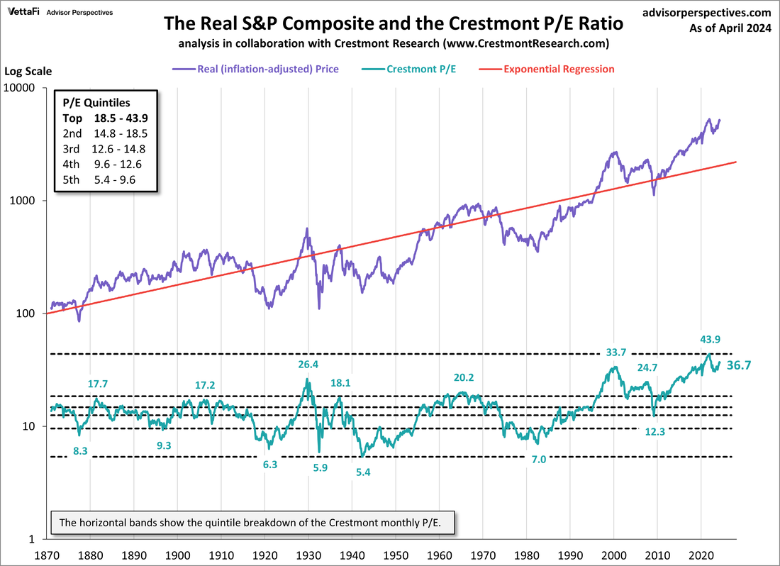
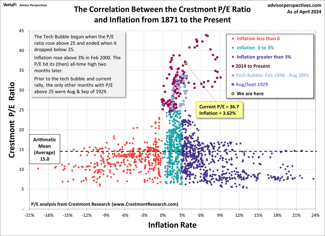
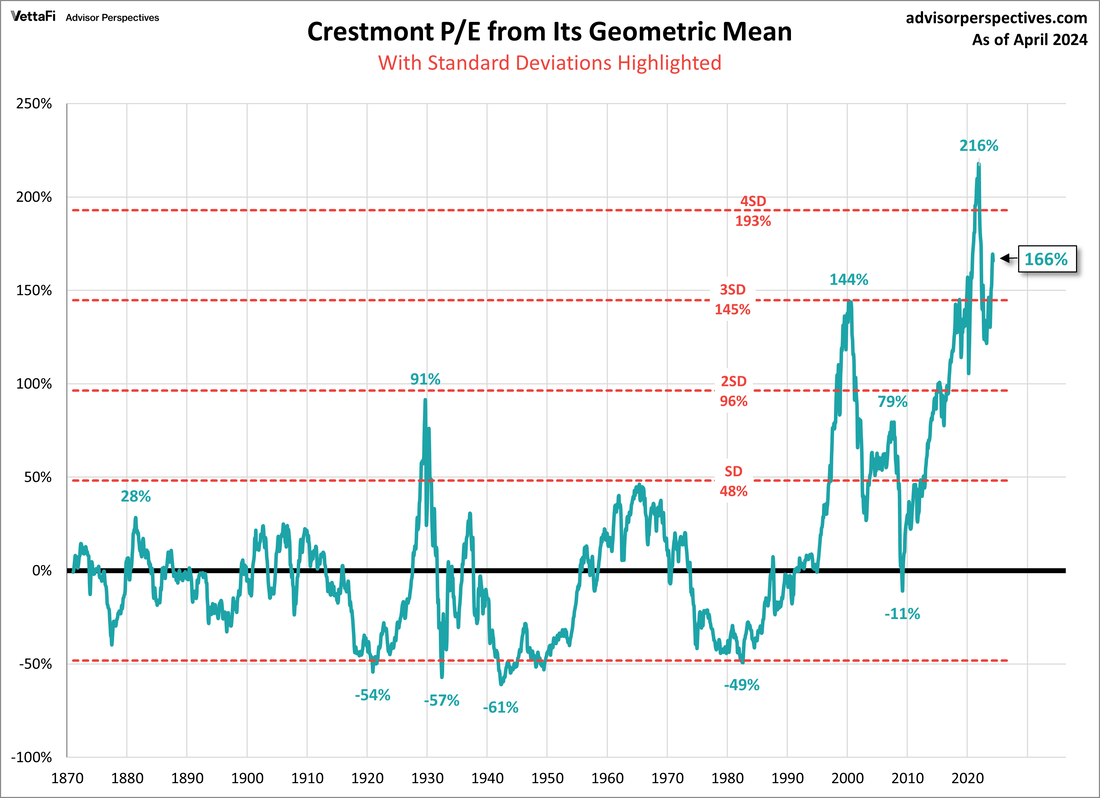
U.S. Equity Market Valuation
Crestmont Price/Earnings Ratio
(Source: Crestmont Research)
(Source: Crestmont Research)
A large part of the expected declines in bear markets hinges upon how "expensive" markets were when the bear market begins. In this measure, we have a long way to fall given the overvaluation at the market peak.
We illustrate the recent market overvaluation via 3 charts produced by Crestmont Research (as of 01 April 2024 with data from 1871-to-Present). While it is not necessary to understand exactly how the data is plotted, it is important for every investor to realize where current valuations stand relative to this 153 years of history.
In the following graphs note the following:
- the Crestmont Price/Earnings (P/E) ratio remains near the most expensive market valuation in U.S. stock market history (but well off its most recent peak) .
- when compared to inflation the current Crestmont P/E has now exceeded the upper extreme portion of the bubble zone defining the 1998-2000 bubble peak as shown on the 2nd chart.
- pay particular attention to chart #2 where it can be seen high equity valuations are historically supported by inflation in the 0-3% range. Inflation remains outside this corridor so markets remain vulnerable to a valuation pullback.
U.S. (NYSE) Margin Debt
(Source: Advisor Perspectives)
We continue to monitor with interest the current margin debt on US markets. For those who are unfamiliar, margin debt is the amount of "loans" taken out by market speculators to leverage up their equity positions. During normal bull markets margin debt will increase as the market continues to climb. This increased margin debt amplifies equity market prices. However, at some point speculators become nervous and begin to reduce their margin positions. This reduction in margin is like letting the air out of a balloon and deflates equity asset prices.
As can be seen on the below graphic, both the 2000 and 2007 market tops were signaled in advance by tops in margin debt (margin debt not inflation adjusted on this chart):
As can be seen on the below graphic, both the 2000 and 2007 market tops were signaled in advance by tops in margin debt (margin debt not inflation adjusted on this chart):
The following chart (source: D. Short) shows US equity margin debt adjusted for inflation. As can be seen, in both 2000 and 2007 inflation-adjusted margin debt peaked and then began to decline leading to the tops in the S&P 500 index. As such, margin debt rollovers acts as a good lead indicator of possible future market weakness.
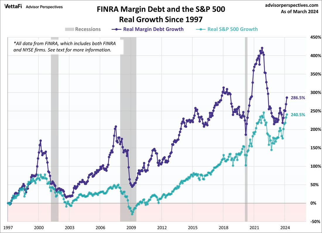
A year-over-year contraction in margin debt tends to be negative for stocks as liquidity is removed from equity markets. Below is the latest YoY rate of change in margin debt (source: Yardini). Note in both the 2000 and 2007 bear markets margin debt bottomed below -40% (but the recent bottoming in margin debt is encouraging).
U.S. Equity market Valuation Models
(Source: D. Short)
Below is a graph representing 4 different long-term valuation measures plotted back to 1900 (123 years):
As of 01 April 2024 the average of these 4 measures places the U.S. stock market (S&P 500 index) as being 148% above its long term geometric mean. This remains near the highest valuation in the history of the stock market going back to 1900 (greater than 3 standard deviations above the geometric mean).
- The Crestmont Research P/E Ratio
- The cyclical P/E ratio using the trailing 10-year earnings as the divisor
- The Q Ratio, which is the total price of the market divided by its replacement cost
- The relationship of the S&P Composite price to a regression trendline
As of 01 April 2024 the average of these 4 measures places the U.S. stock market (S&P 500 index) as being 148% above its long term geometric mean. This remains near the highest valuation in the history of the stock market going back to 1900 (greater than 3 standard deviations above the geometric mean).
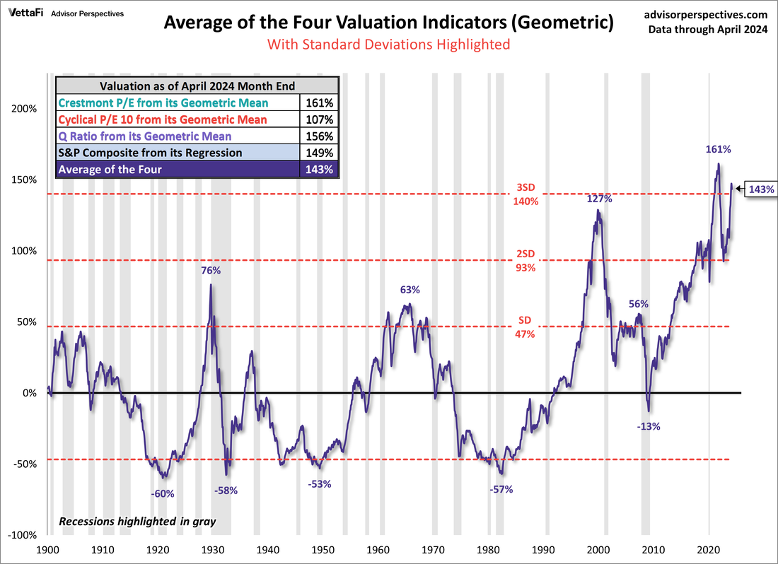
Another popular valuation metric is know as the "Buffett-Indicator". In an interview with Fortune magazine back in 2001 Warren Buffett remarked "it is probably the best single measure of where valuations stand at any given moment."
The indicator measures the price of Corporate Equities (Mkt Cap) to Gross Domestic Product (GDP) as a ratio going back to 1950. As can be seen below, the ratio of equity prices relative to last reported GDP has now moved well below its recent peak and is currently in the "overvalued" zone (> 33.6% above the detrended regression line).
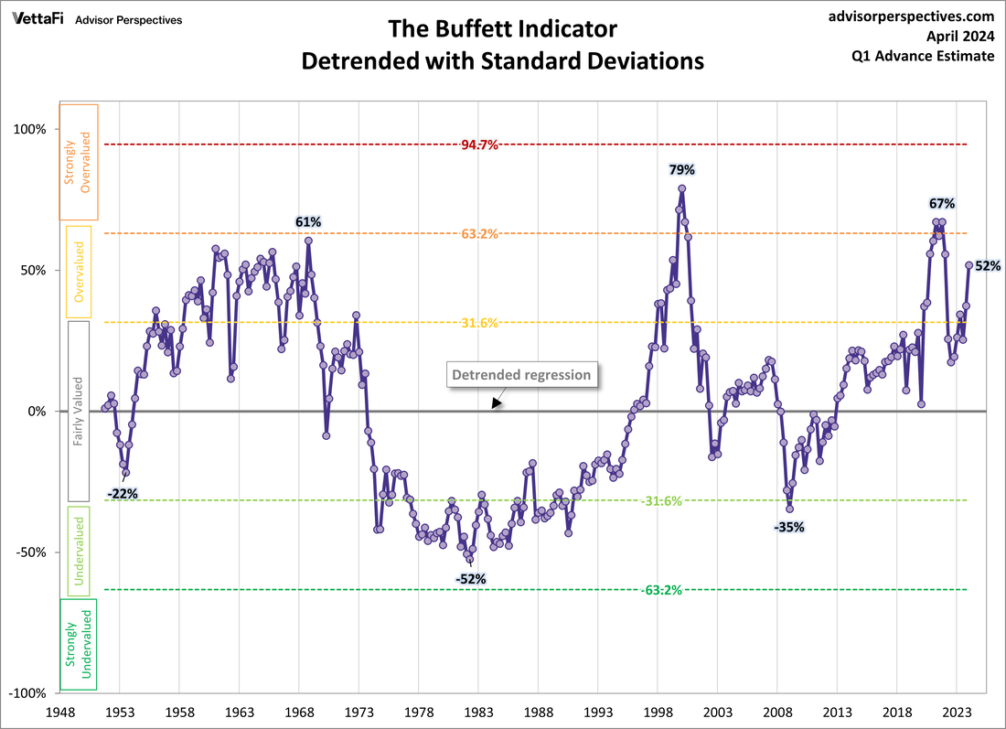
7-Year Asset Class Real Return Forecast
(Source: GMO LLC)
Each month GMO (Grantham, Mayo, Van Otterloo & Co.) publishes a forward forecast for expected annual real rates of return (i.e. inflation adjusted) for a number of different asset classes with a 7 year forward outlook. They have historically had a very good track record (0.97 correlation) of estimating forward 7 year asset class returns based primarily upon current valuations combined with mean reversion. Charts are published following analysis of the previous months data.
We have followed GMO's methodology with interest for many years. In our experience we have found them to be conservative over the shorter term with a tenancy to make calls too early. HOWEVER, similar to Dr. John Hussman of Hussman Funds, they also tend to be right over the longer term. As such, we use their outlook as part of the valuation model within the ECAM 5 Factor model.
Above is their current forecast of expected real returns (after inflation) for the next 7 years broken down by asset class. It is clear based upon current market valuations GMO forecasts well below average annual investment returns in all asset classes with a 7 year forward time horizon (the dotted line is the historical real return of U.S. equities of +6.5% per year). This is important for those who may be soon retiring and expecting "average" returns on their equity and bond investments over the next 7 years. Current high market valuations make it a certainty forward returns over the next 7-10 years will be well below historical averages.
Global Asset Class 10-year Expected Nominal Return Forecast
(data as of 31 August 2023)
(Source: Research Affiliates)
(data as of 31 August 2023)
(Source: Research Affiliates)
Below is the projected 10 year nominal (non-inflation adjusted) returns for the majority of global asset classes.
Data continues to point to Emerging Market and EAFE (Europe, Africa and Far East) equities as providing the greatest equity returns over the next 10 years.
Data continues to point to Emerging Market and EAFE (Europe, Africa and Far East) equities as providing the greatest equity returns over the next 10 years.
|
Legend
|
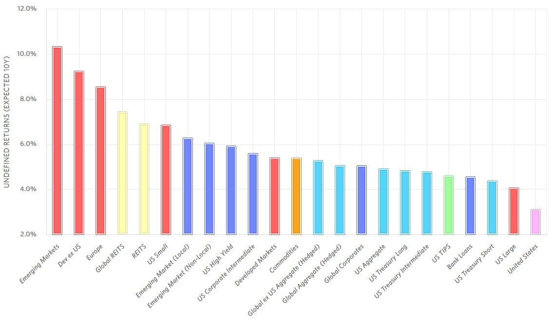
|
Cycle Commentary
Below is a 20 year chart of the seasonal monthly performance of the Dow Jones Global Index. The number at the top of the column is the percentage of time the month had a positive return and at the bottom is the average percentage gain/loss for the month.
Dow Jones Global Index Market ($DJW)
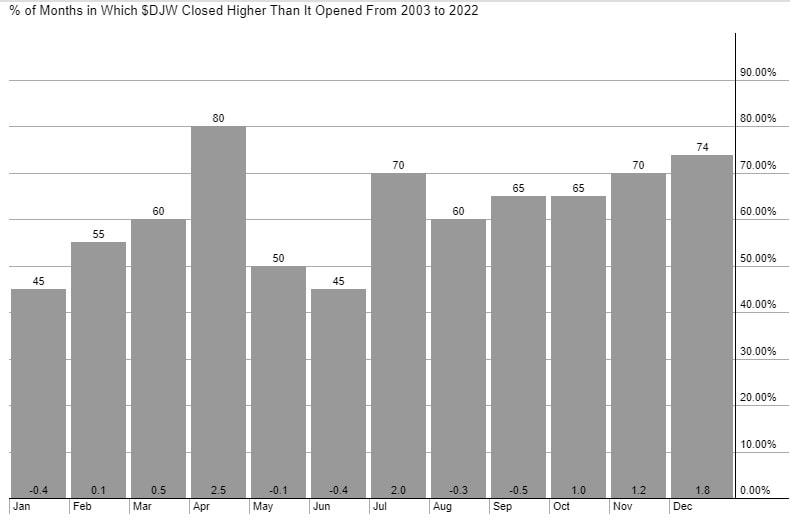
As can be seen, over the past 20 years (2003-2022) the period October-April yearly offers the highest potential global equity market returns (cumulative +6.7% average return) while the period May-September offers little in total return relative to risk (+0.7% cumulative average return). The month of April remains the strongest month with an 80% success rate and an average +2.5% return.
In the interest of moving more towards more recent market action broken down by region, below is the seasonal returns for our each of our selected ETF benchmarks going back to the start of the bull market in 2009:
|
Region
|
October-April
|
May-September
|
|
Global Equities (VT)
U.S. Equities (VTI) European Equities (VGK) Asia Pacific Equities (VPL) Emerging Market Equities (VWO) |
+8.9%
+10.9% +7.6% +6.0% +8.6% |
+1.8%
+3.0% +0.5% +0.9% -0.5% |
|
Vanguard Total World Market (VT)
Vanguard FTSE European Total Market (VGK)
|
Vanguard U.S. Total Market (VTI)
Vanguard FTSE Pacific Total Market (VPL)
|
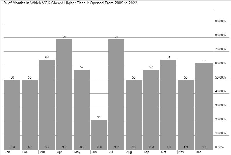
Vanguard FTSE Emerging Total Market (VWO)
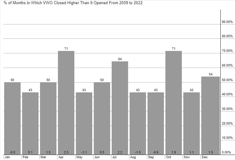
|
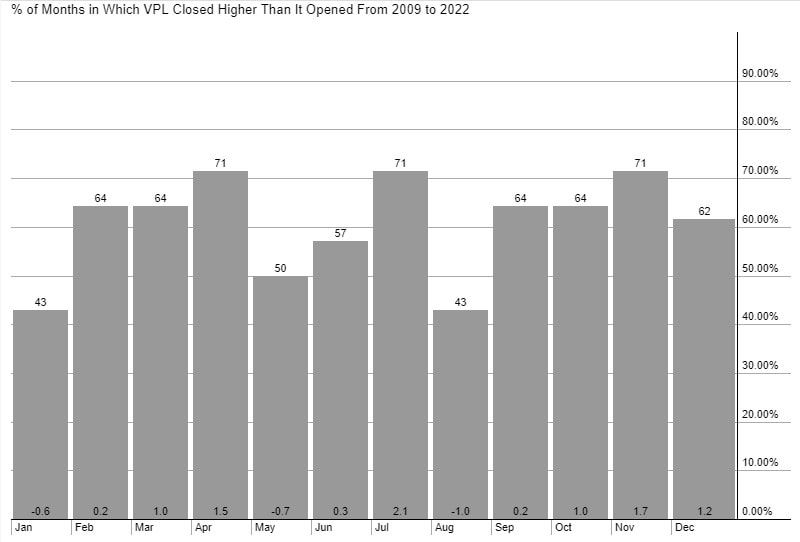
|
S&P 500 Seasonality (historical 50 year look-back annual seasonality)
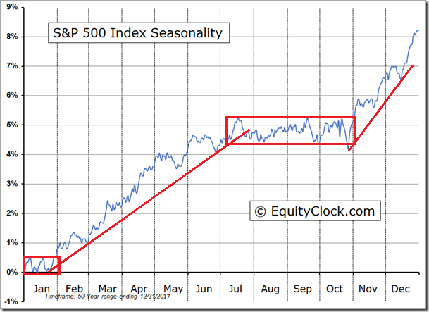
"Turning to the months ahead, the performance for January and February is rather lacklustre compared to the months that bookend this start of year period. The S&P 500 Index has gained an average of 0.8% and 0.2%, respectively in the first two months of the year, based on the past 50 periods. These months are easily the weakest of the best six month trend for stocks. The large-cap benchmark has closed positive just over half of the time (56%) in January and February, making this winter lull little better than a flip of a coin in terms of the frequency of success.. Returns for January have ranged from a loss of 8.6% in 2009 to a gain of 13.2% in 1987. Performance tends to gyrate in the middle of January with the majority of the strength achieved in the first few days and last few days of the period".
Ned Davis Research 2023 Composite Model
The following is the composite directional model forecast for the S&P 500 index for 2022 based upon the following parameters (each equal weighted within the composite model) for data from 1928-2022:
- 10-year Decennial Market Cycle
- 4-year Presidential Market Cycle
- 1-year Annual Seasonal Market Cycle
The levels are not as important as the general trends as indicated by the Composite model.

The 2023 composite model indicates the following historical "glidepath" based upon cycles from 1928-2022:
- a consistent trending market advance into mid-July
- a choppy pullback to lows in late-November
- a strong rise into year-end.
U.S. 4-Year Presidential Election Cycle
* 2023 is Year-3 ("Pre-Election") of the 4-year cycle
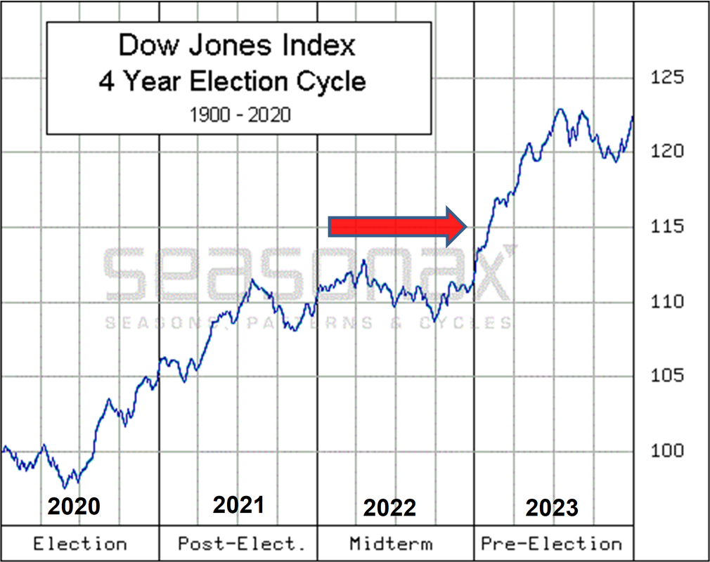

As can be seen on the chart above, historically since 1900 the 3rd year (pre-election year ) of the 4 year Presidential Cycle tends to provide the best returns of the 4-year cycle.
While we do not make investment decisions strictly based upon cycle analysis, we are cognizant of the historical nature of these cycles as they tend to define the political environment's influence upon stock market returns.
Of the 4-year cycle, the strongest quarters are the 4th quarter of Year 2 (Oct-Dec 2022) and the 1st 2 quarters of Year-3 (Jan-Jun 2023).
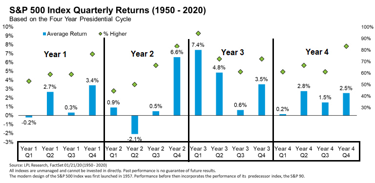
Presidential Cycle S&P 500 returns (inc. dividends):
|
1988-Year 4: +12.40%
1989-Year1: +27.25% 1990-Year 2: -6.56% 1991-Year 3: +26.31% 1992-Year 4: +4.46% 1993-Year 1: +7.06% 1994-Year 2: -1.54% 1995-Year 3: +34.11% 1996-Year 4: +20.26% 1997-Year 1: +31.01% 1998-Year 2: +26.67% 1999-Year 3: +19.53% 2000-Year 4: -10.14% |
2001-Year 1: -13.04%
2002-Year 2: -23.37% 2003-Year 3: +26.38% 2004-Year 4: +8.99% 2005-Year 1: +3.00% 2006-Year 2: +13.62% 2007-Year 3: +3.53% 2008-Year 4: -38.49% 2009-Year 1: +23.45% 2010-Year 2: +12.78% 2011-Year 3: +0.00% 2012-Year 4: +13.41% 2013-Year 1: +29.60% |
2014-Year 2: +11.39%
2015-Year 3: -0.73% 2016-Year 4: +11.96% 2017-Year 1: +21.83% 2018-Year 2: -4.38% 2019-Year 3: +31.49% 2020-Year 4: +16.26% 2021-Year 1: +26.89% 2022-Year 2: -19.44% 2023-Year 3: TBD |
U.S. S&P 500 Index Bear Markets
(source: Ben Carlson, CFA)
(source: Ben Carlson, CFA)
Recessionary Bear Markets (1928-2022):
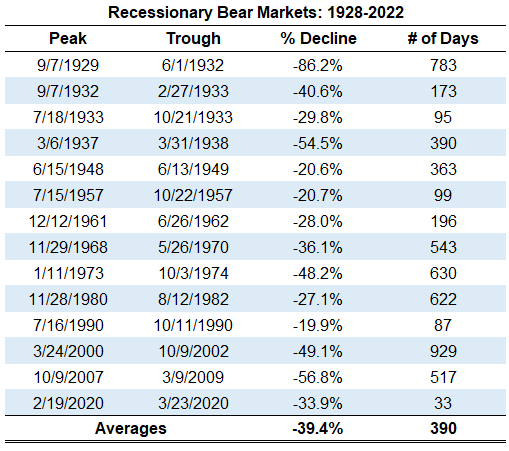
Non-Recessionary Bear Markets (1928-2022):
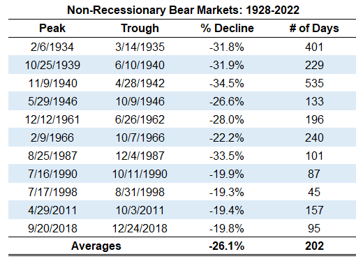
Recessionary vs Non-Recessionary Bear Market Returns (1928-2022):